
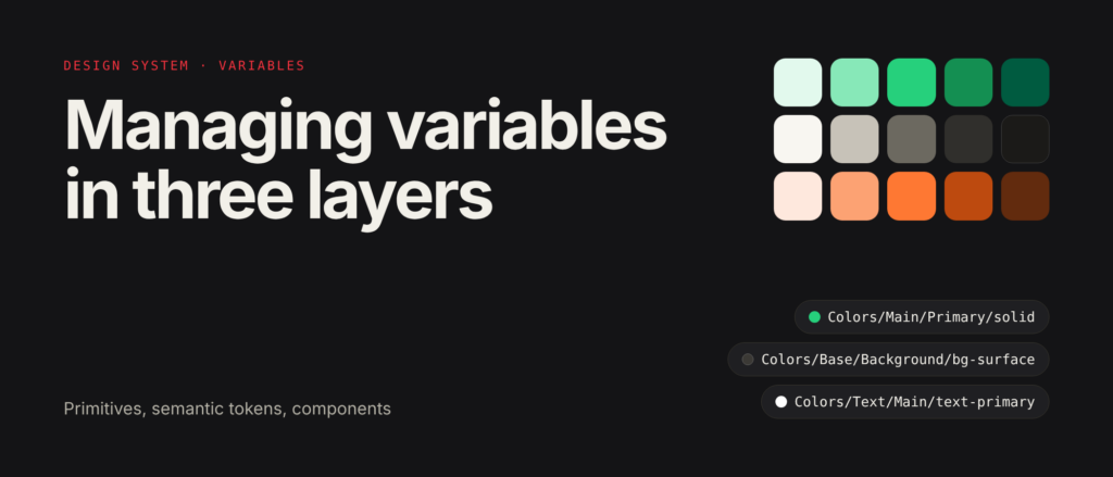
Design system
I design digital products so complex experiences become clear and easy to use.
About
10+ years designing for web and mobile. I look at design through both the interface and how a product runs and scales.
Selected projects
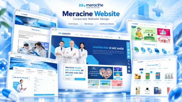


Corporate website for the pharmaceutical brand Meracine.
View project ↗A digital storefront focused on product discovery and the shopping experience.
View project ↗A unified digital identity system for the entire Coin98 ecosystem.
Kick it out of your head: a fun mobile experience for booking tickets and sharing boarding passes.
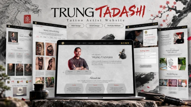
Website for tattoo artist Trung Tadashi: portfolio, services, blog and tattoo booking.
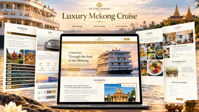
View project ↗Landing page for a Mekong river cruise: journey overview, itinerary, ship, dining, cabins and a booking form.
Many more projects not yet added...
Case study UX
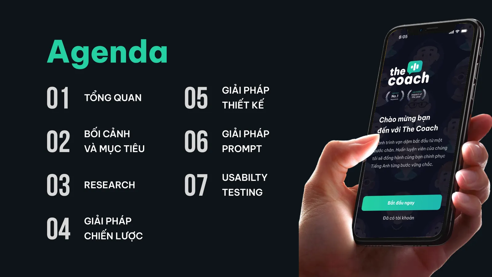
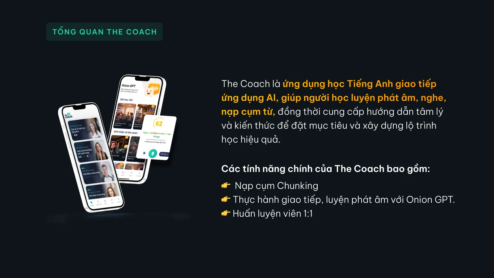
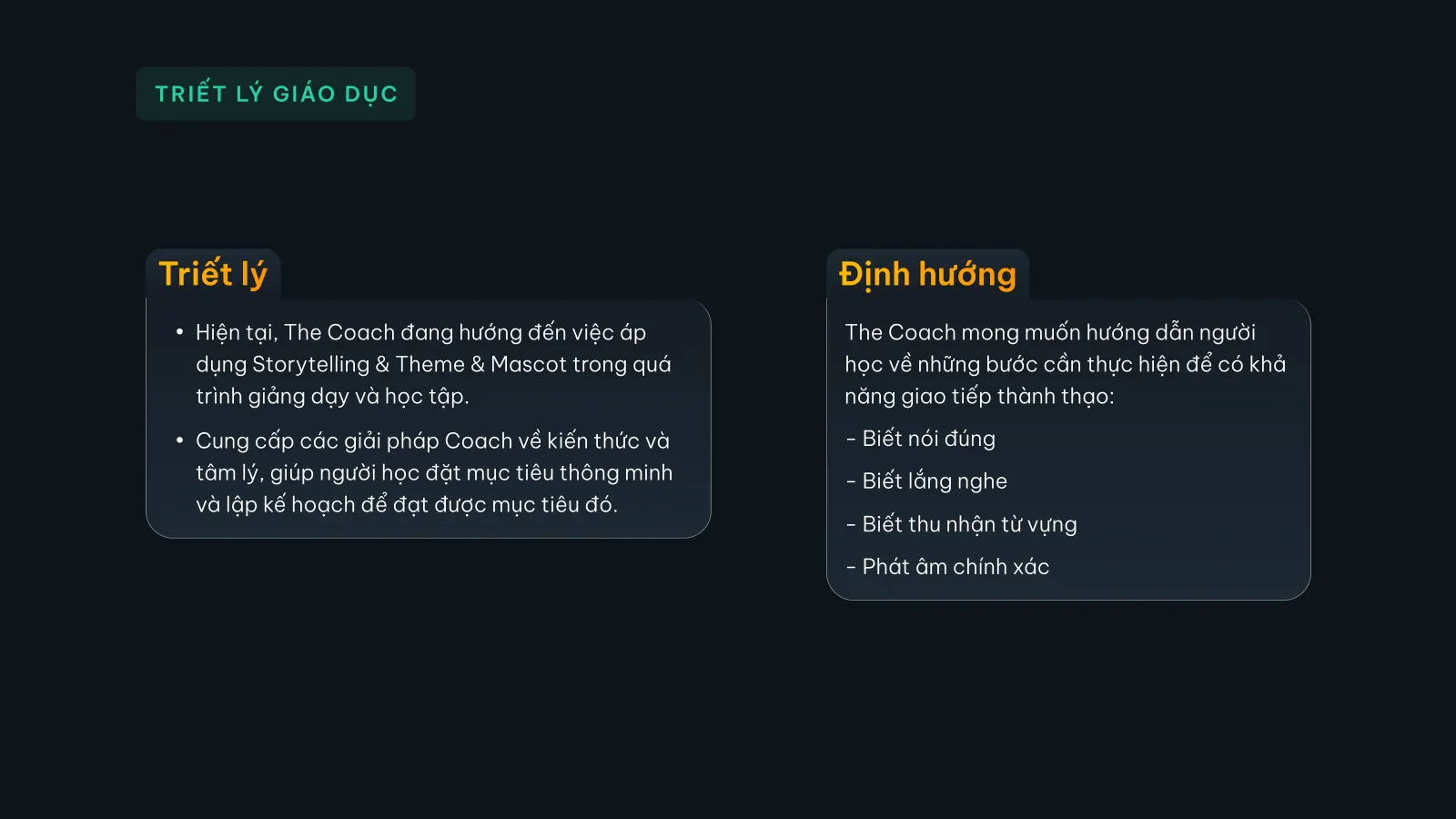
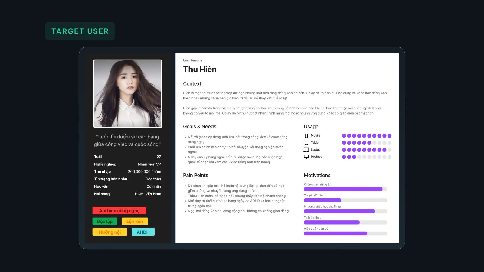
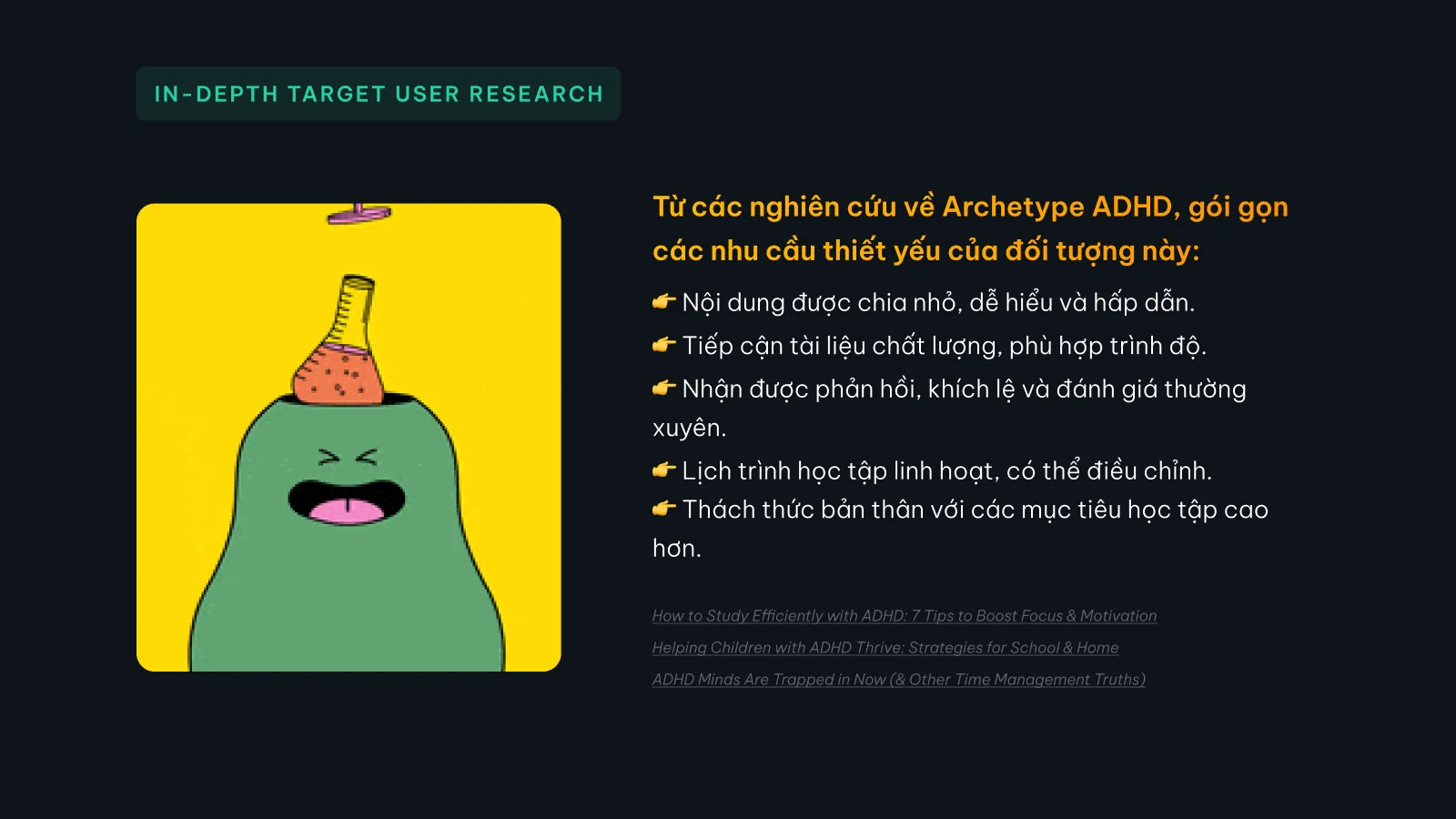
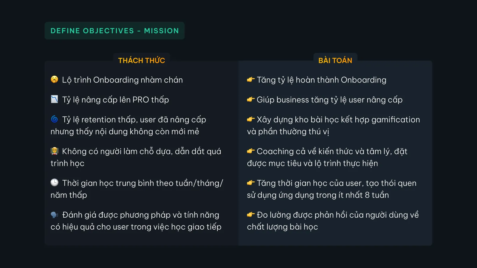
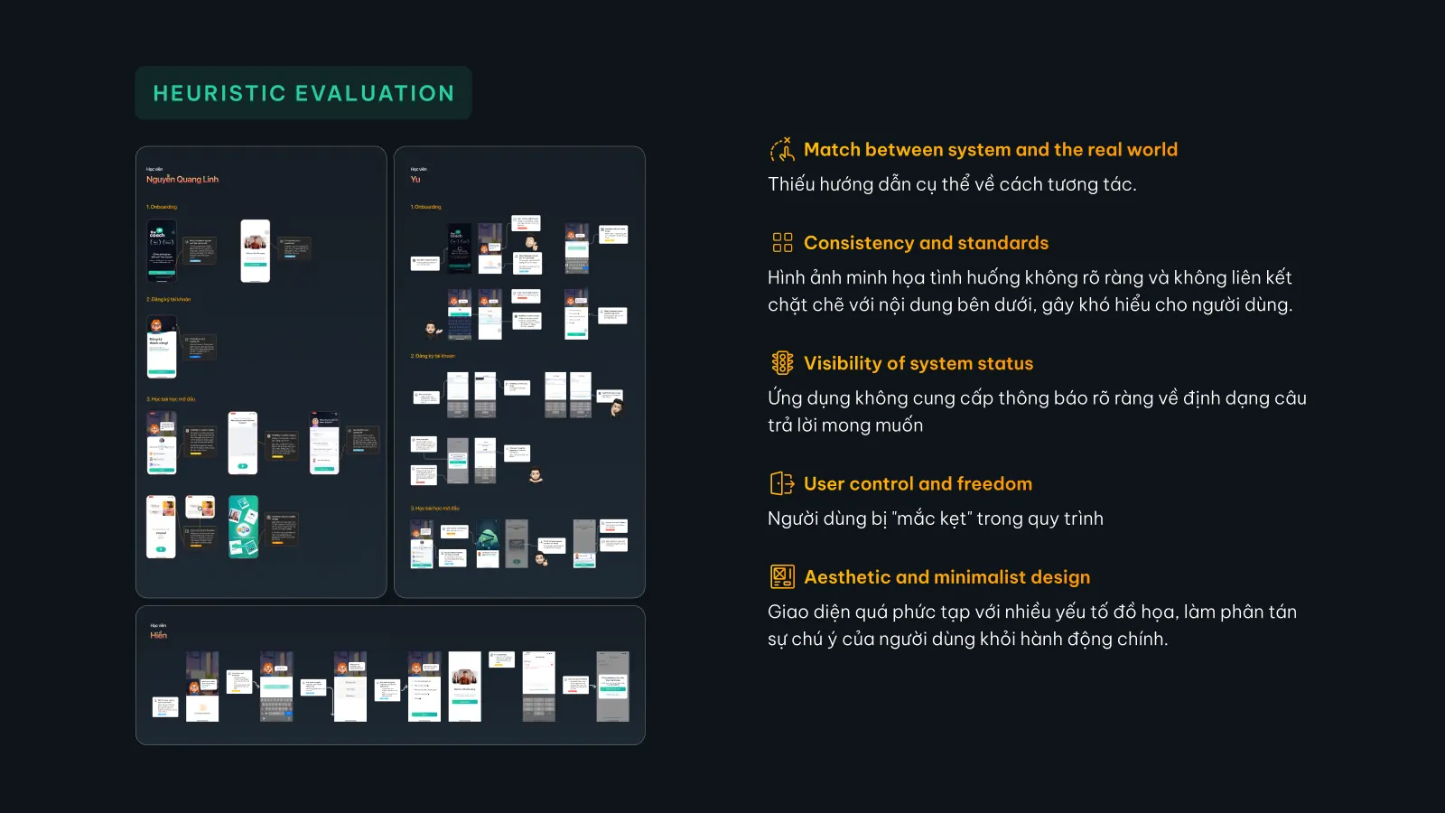
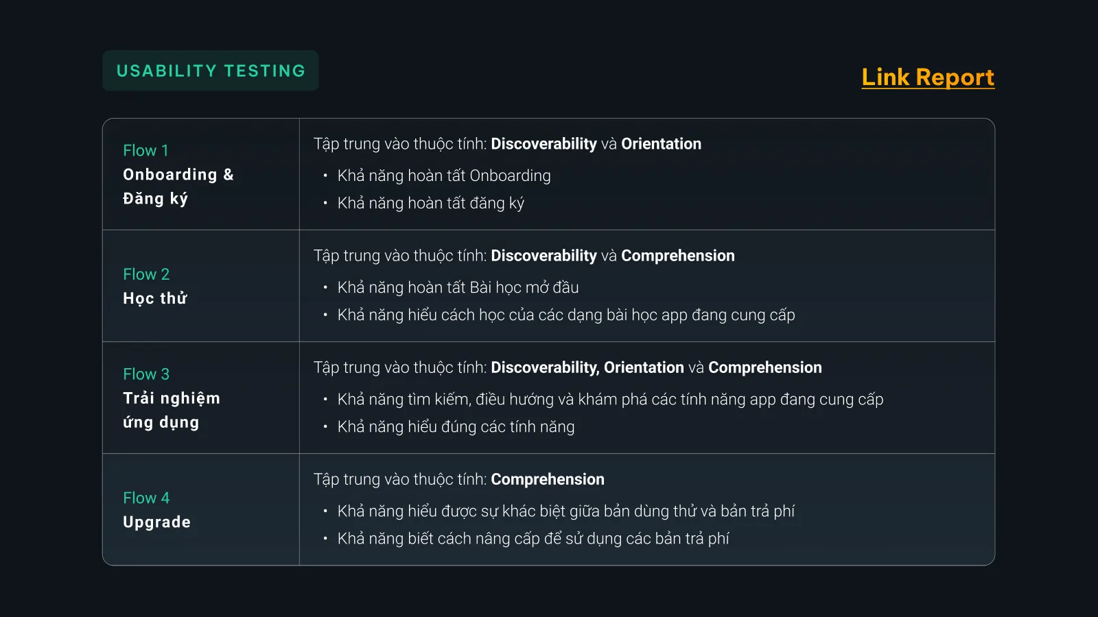
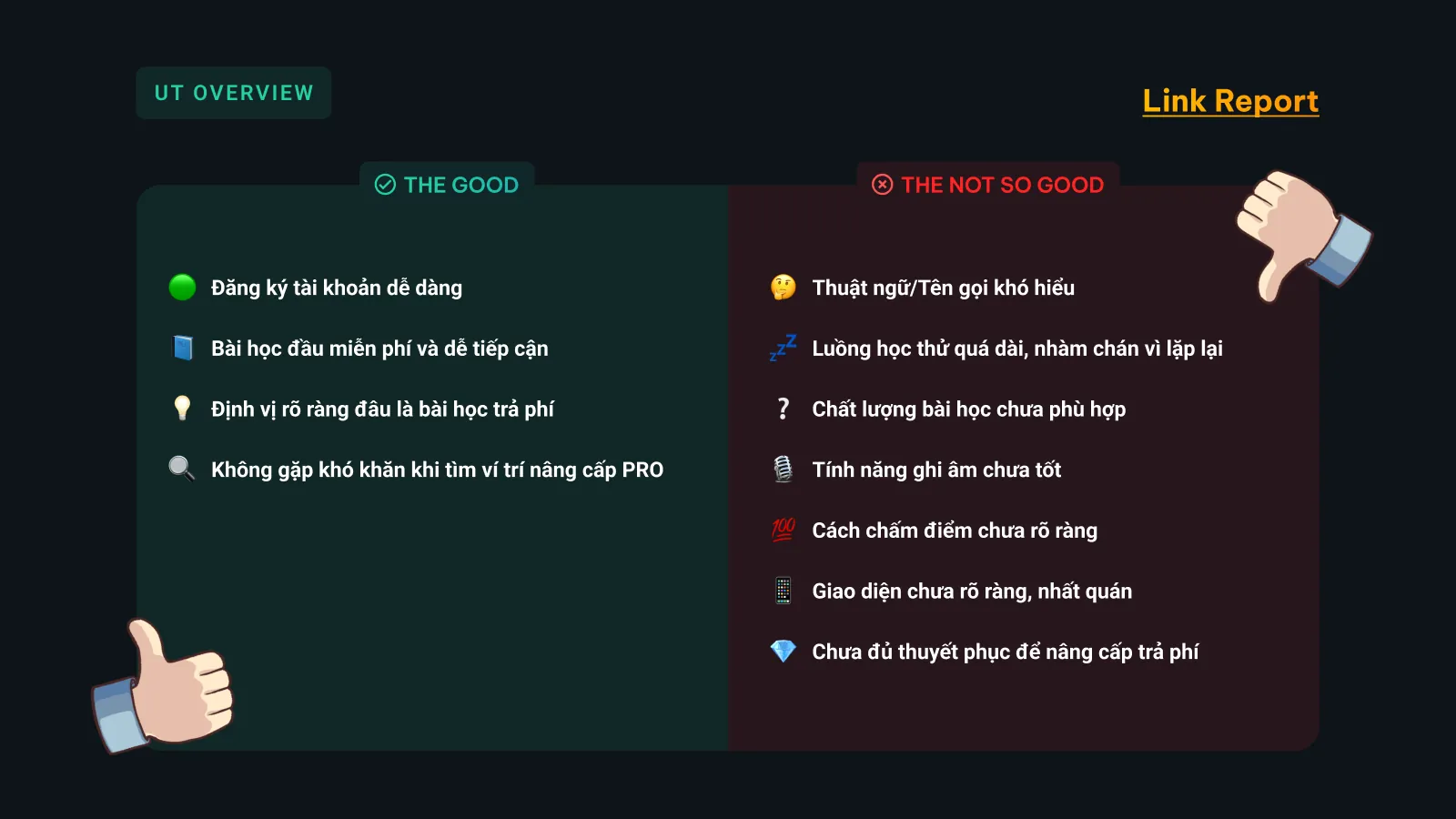
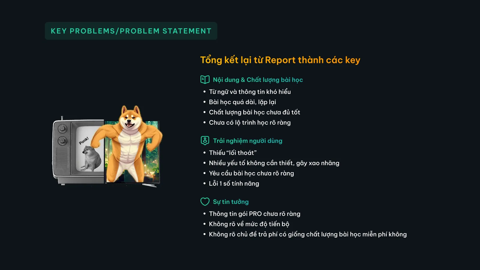
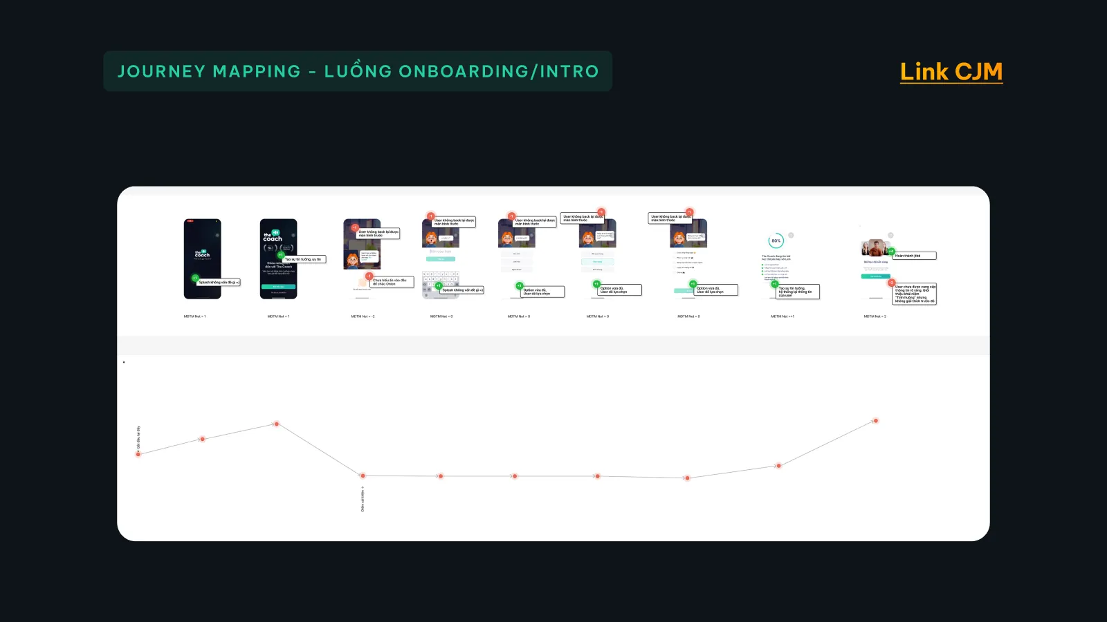
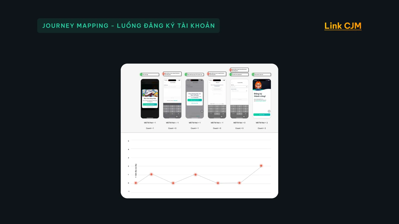
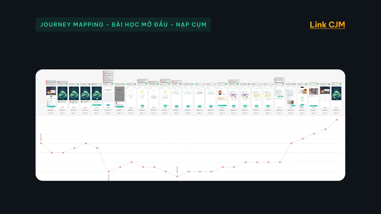
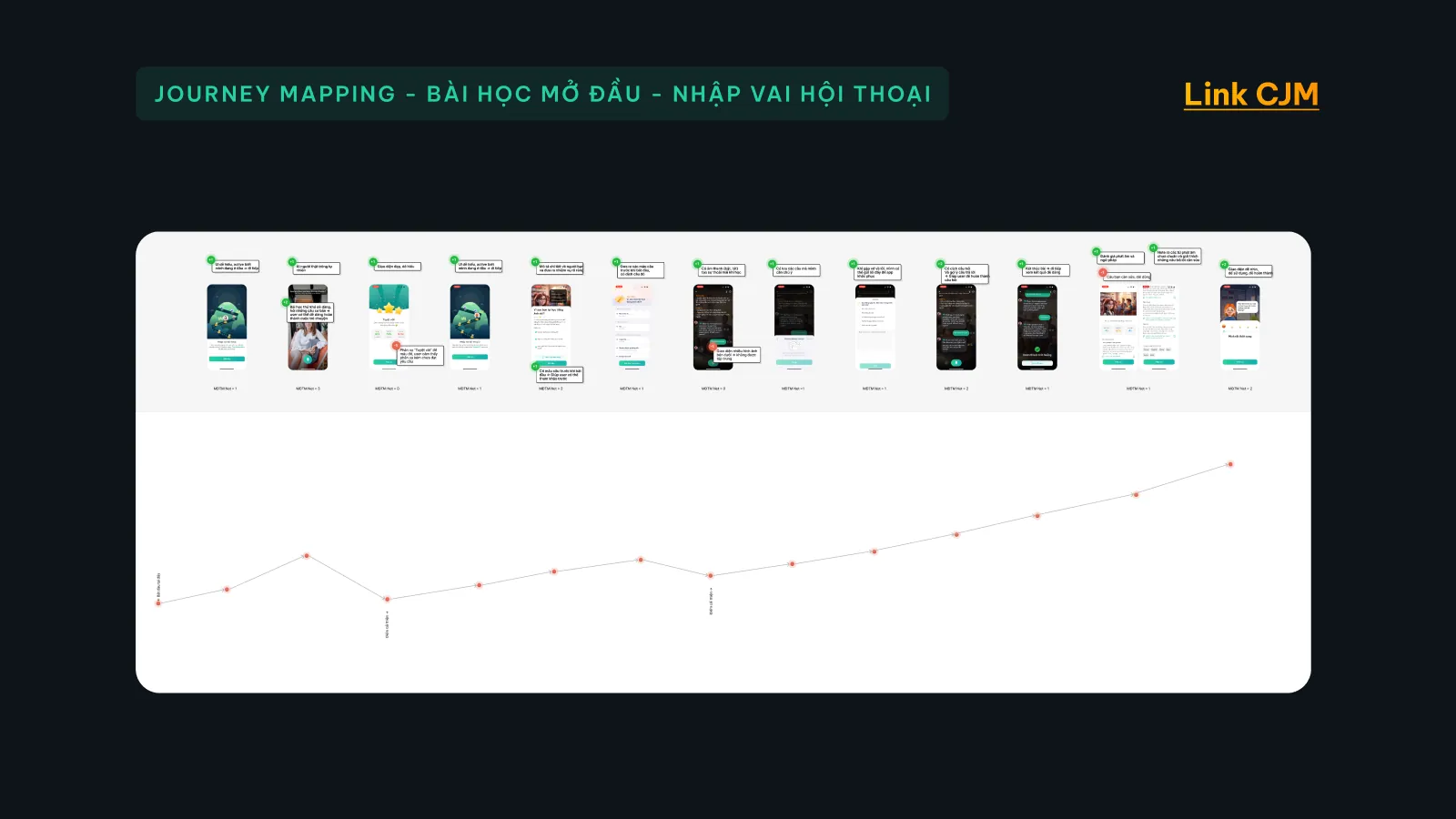
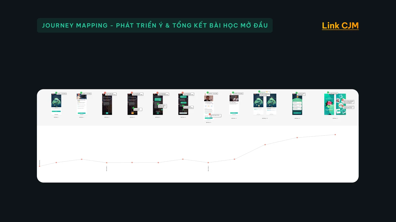
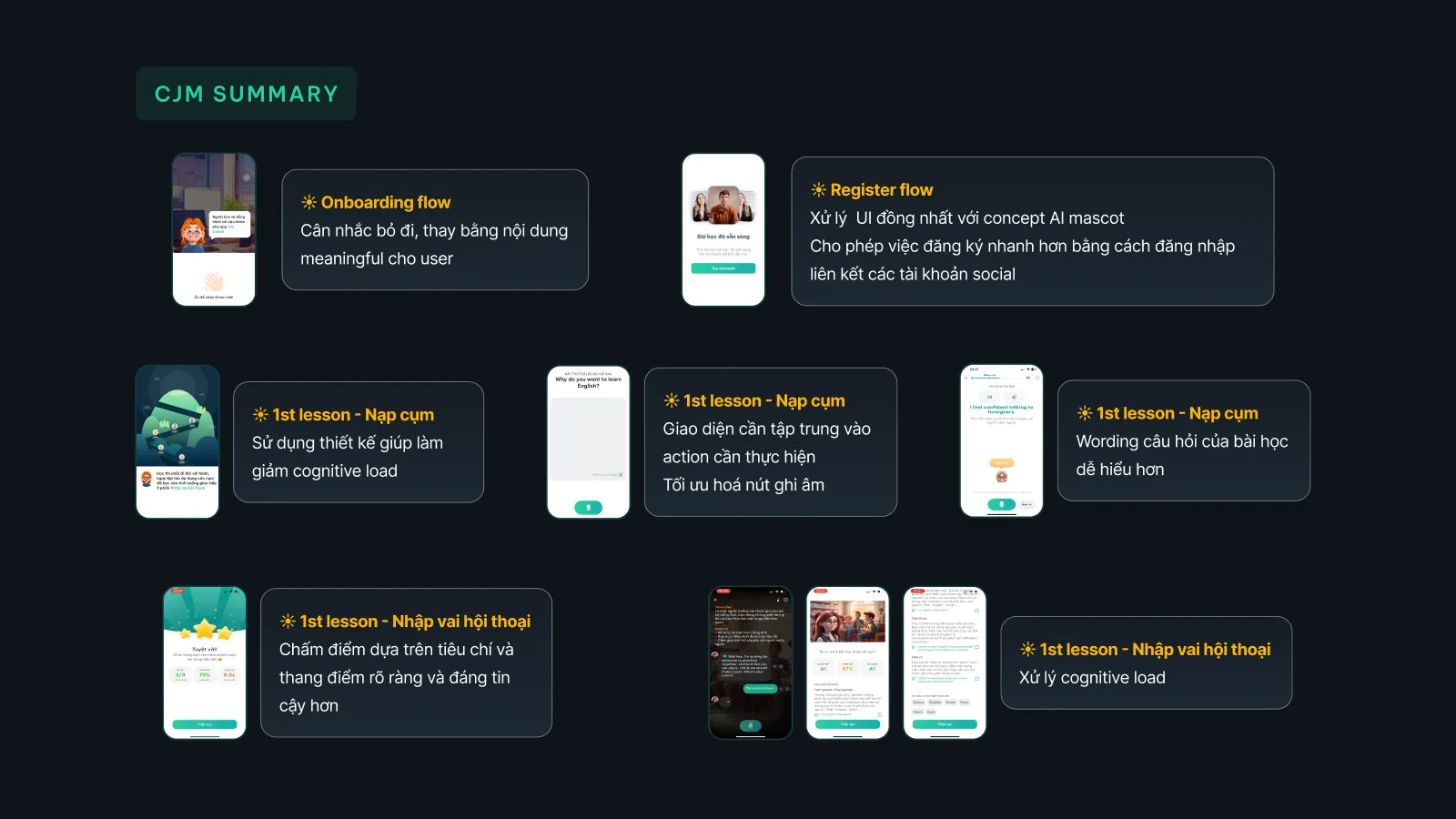
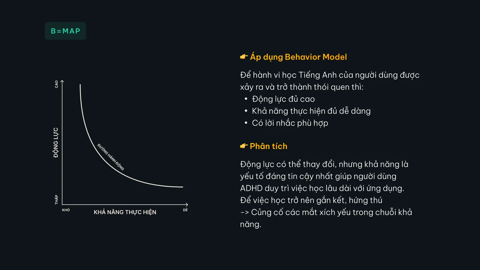
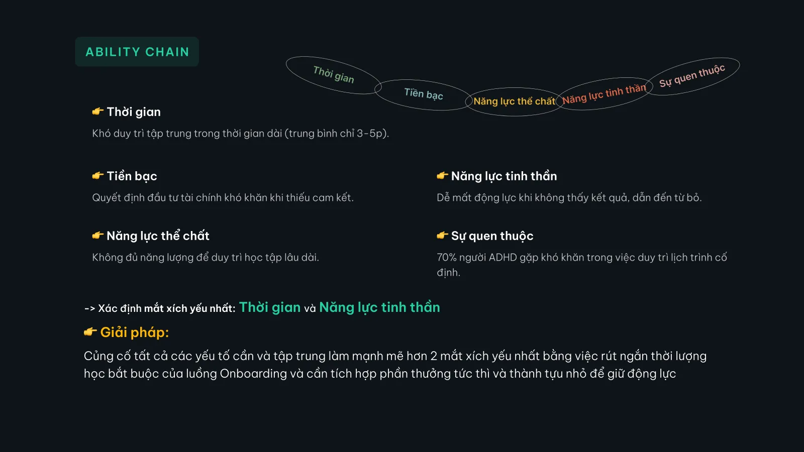
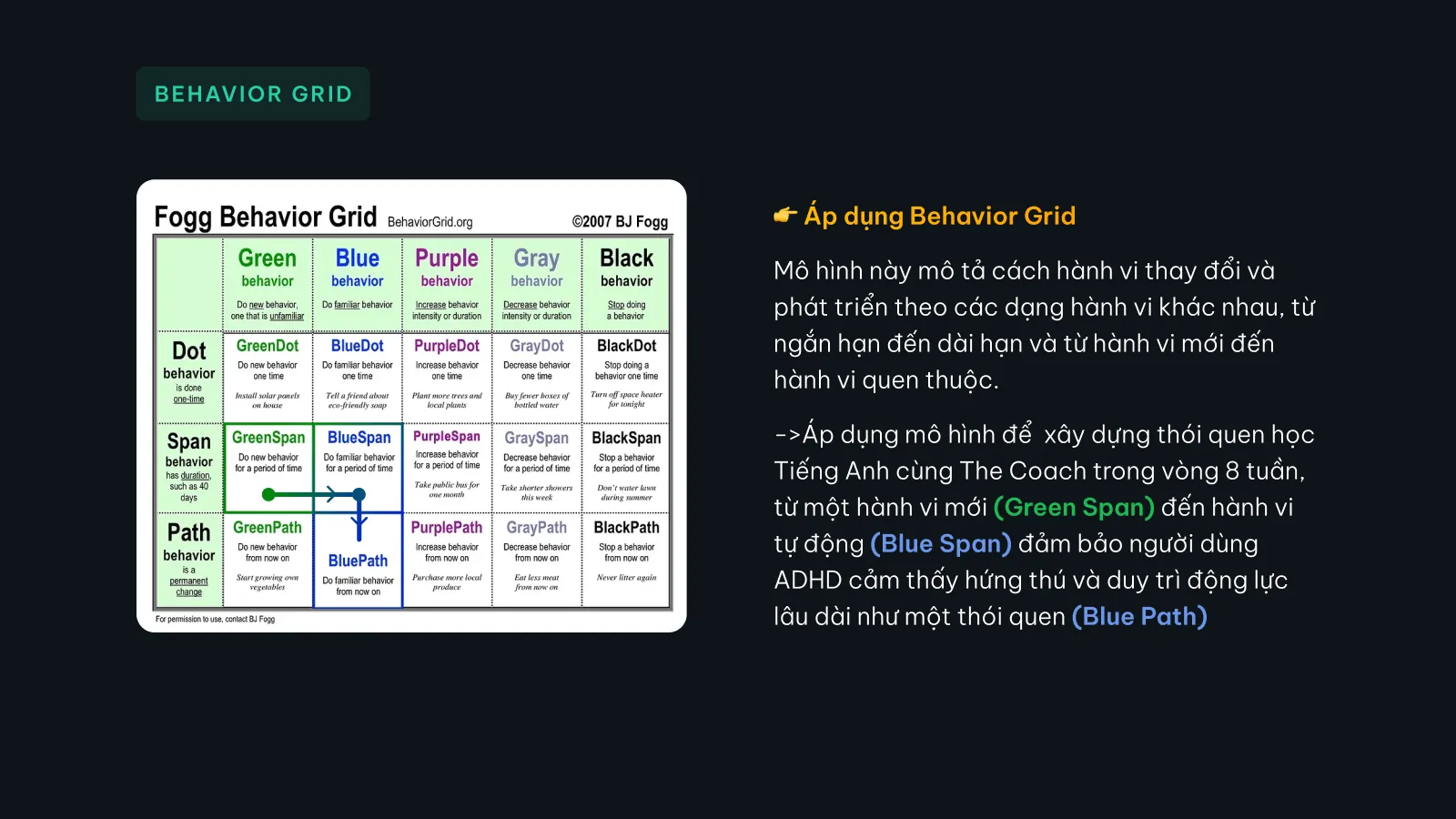
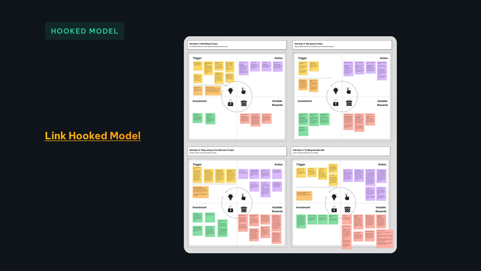
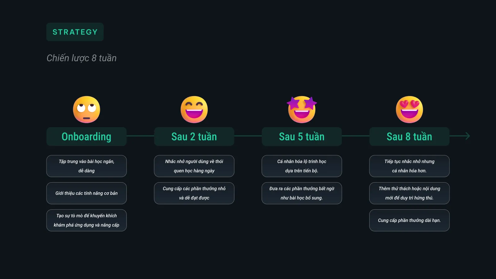
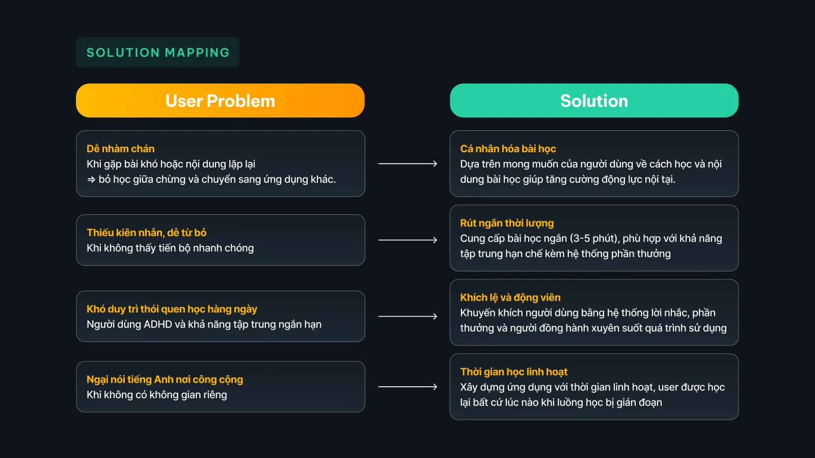
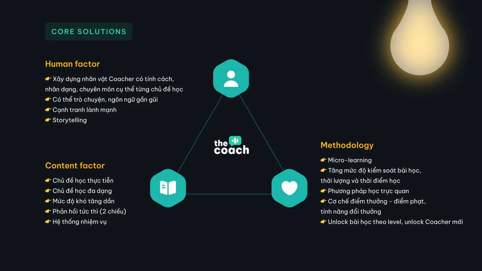
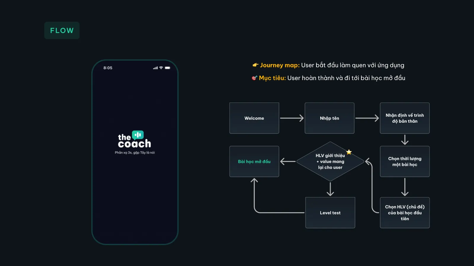
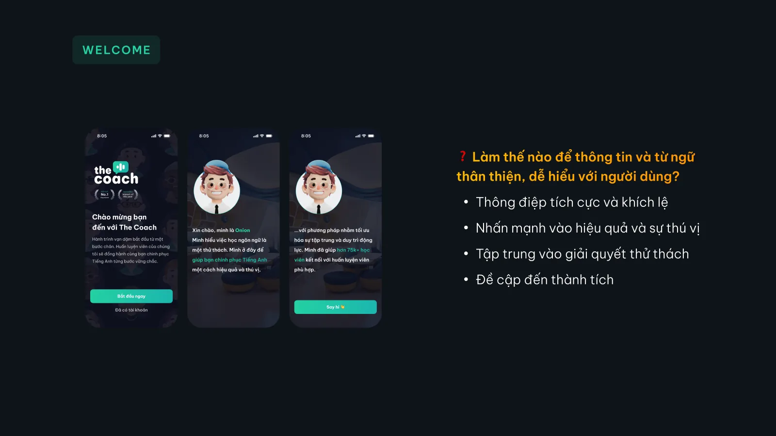
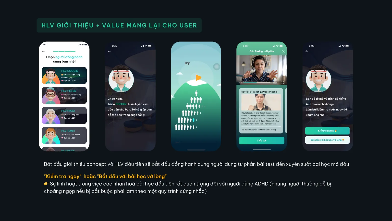
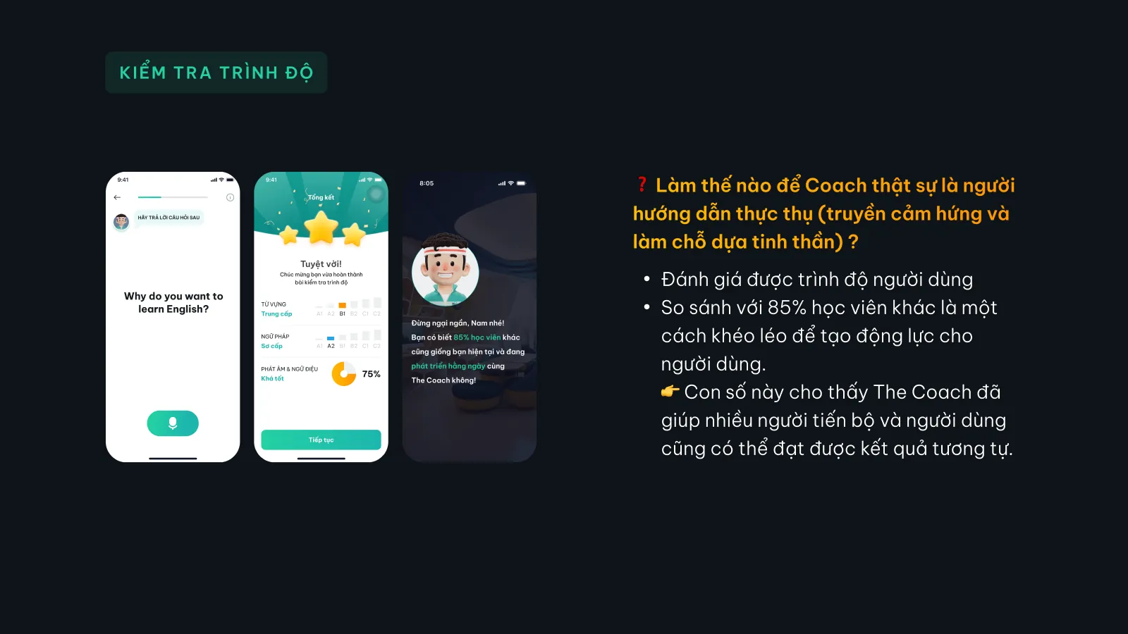
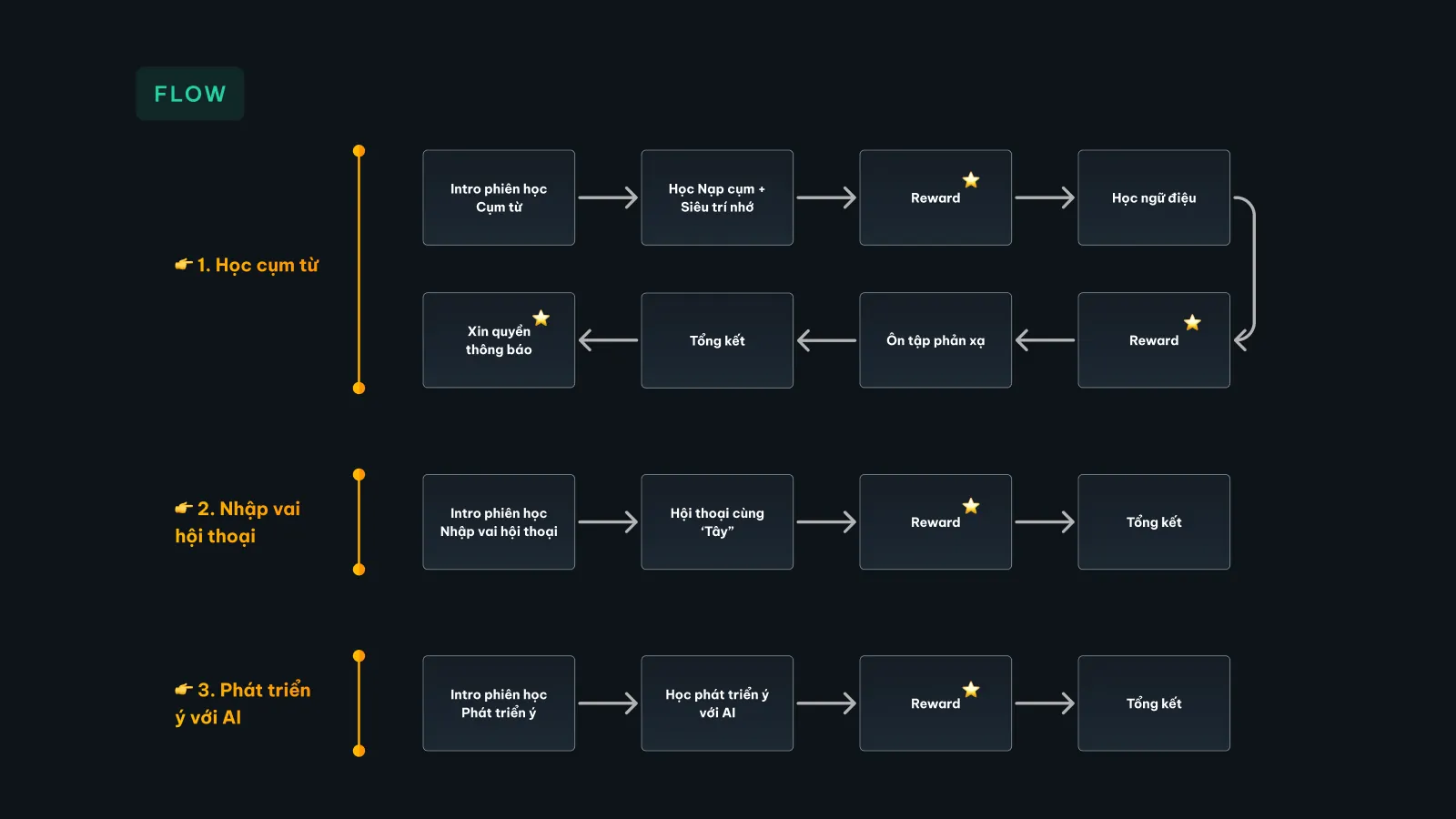
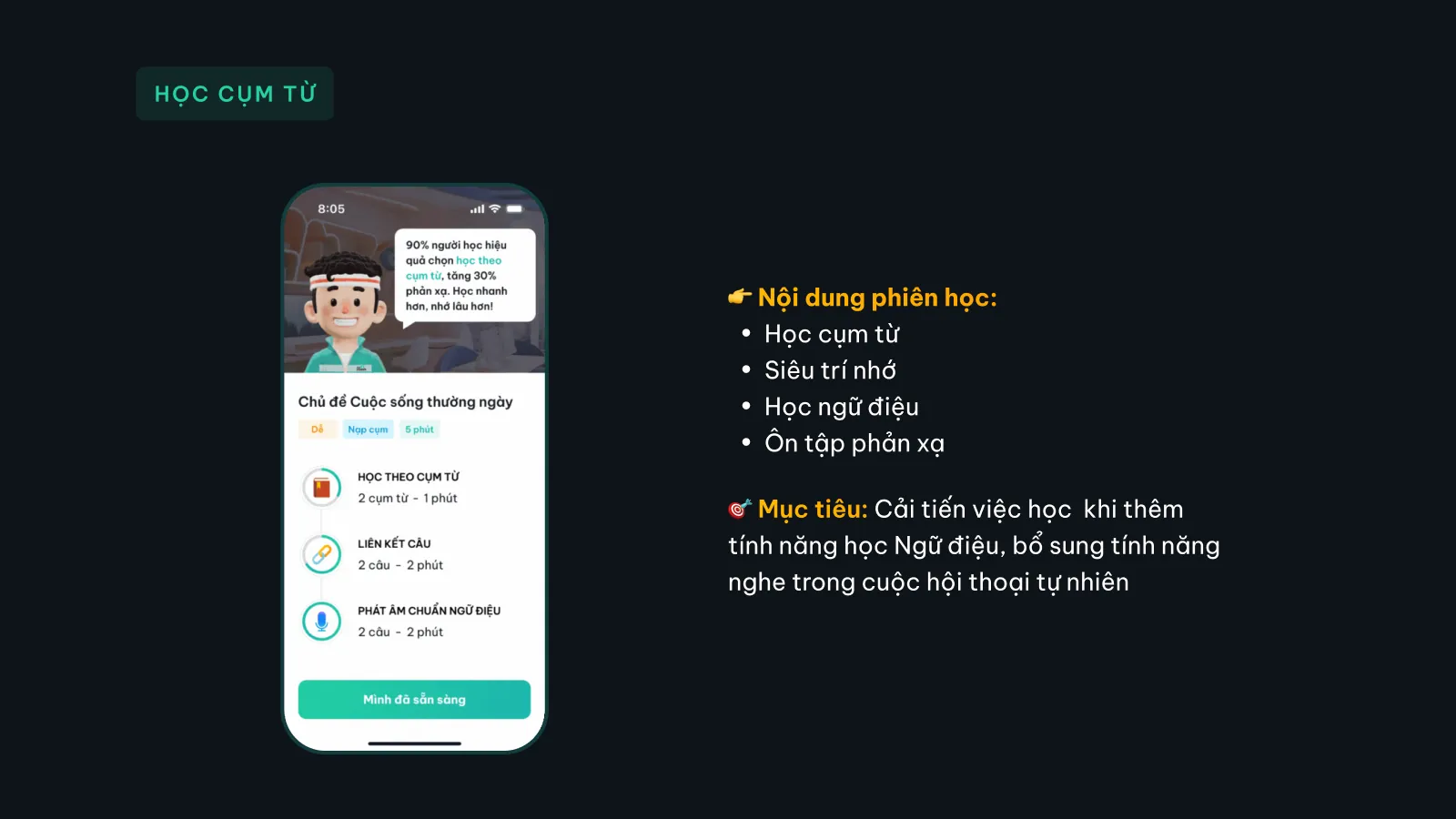
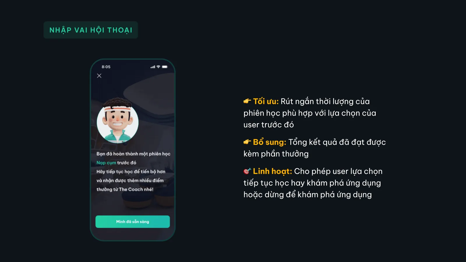
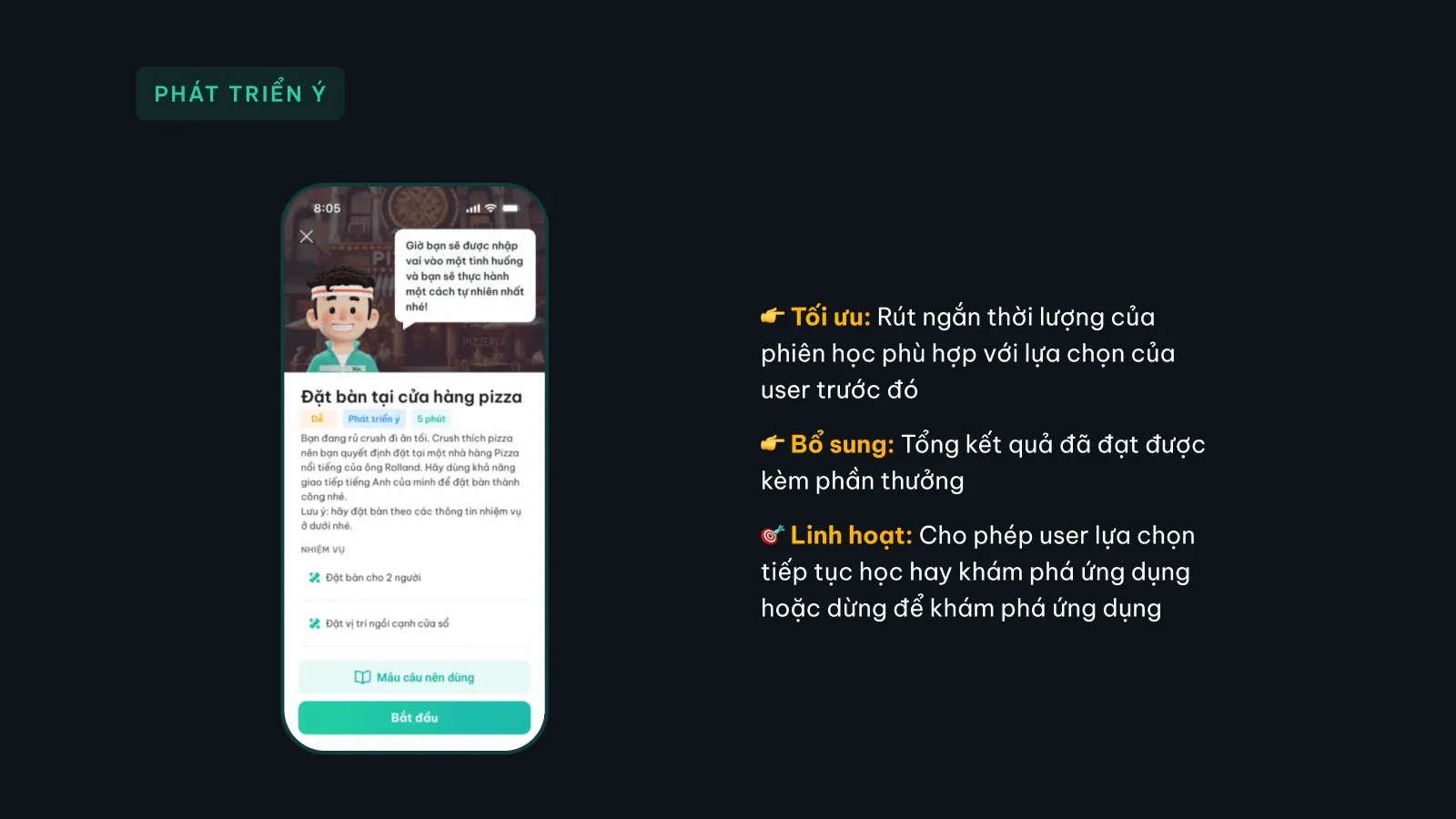
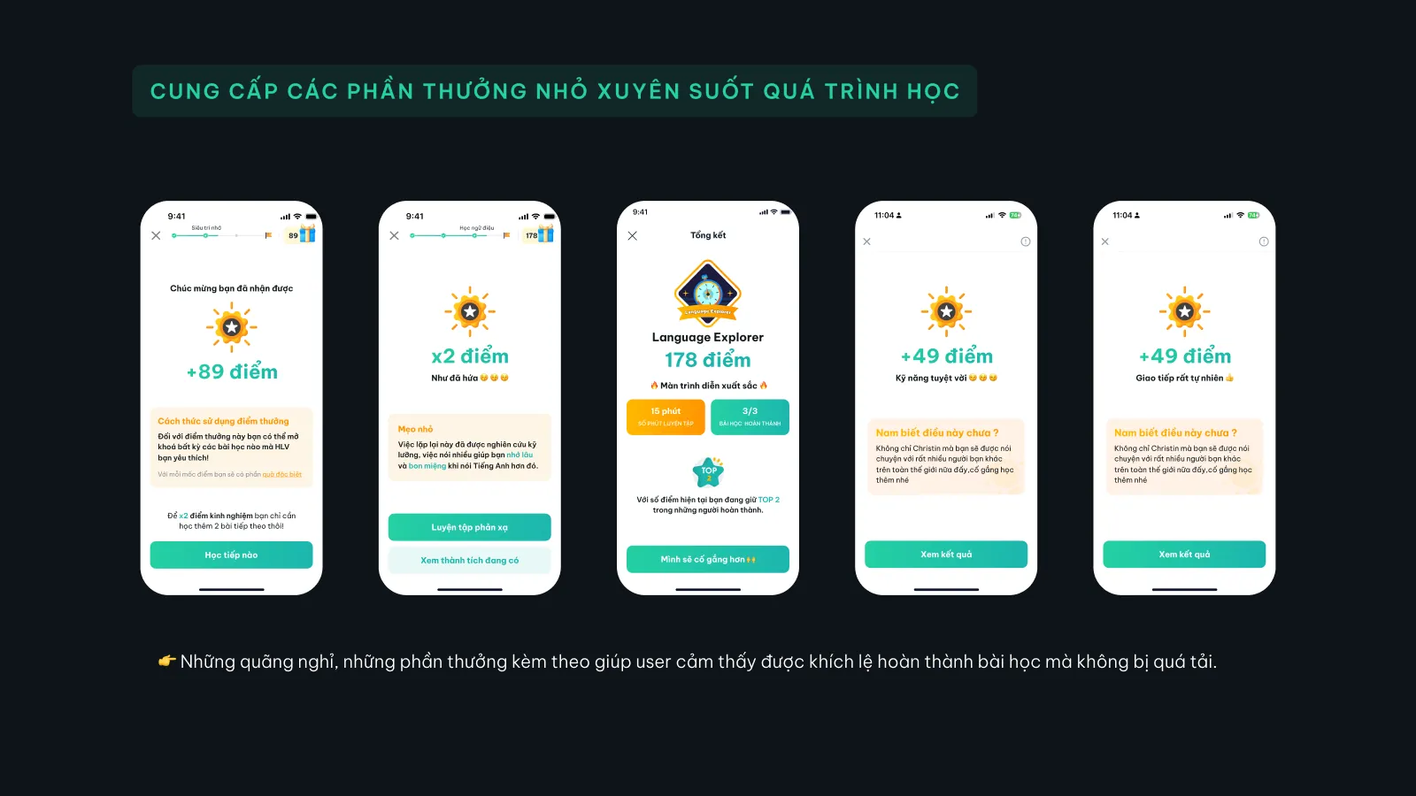
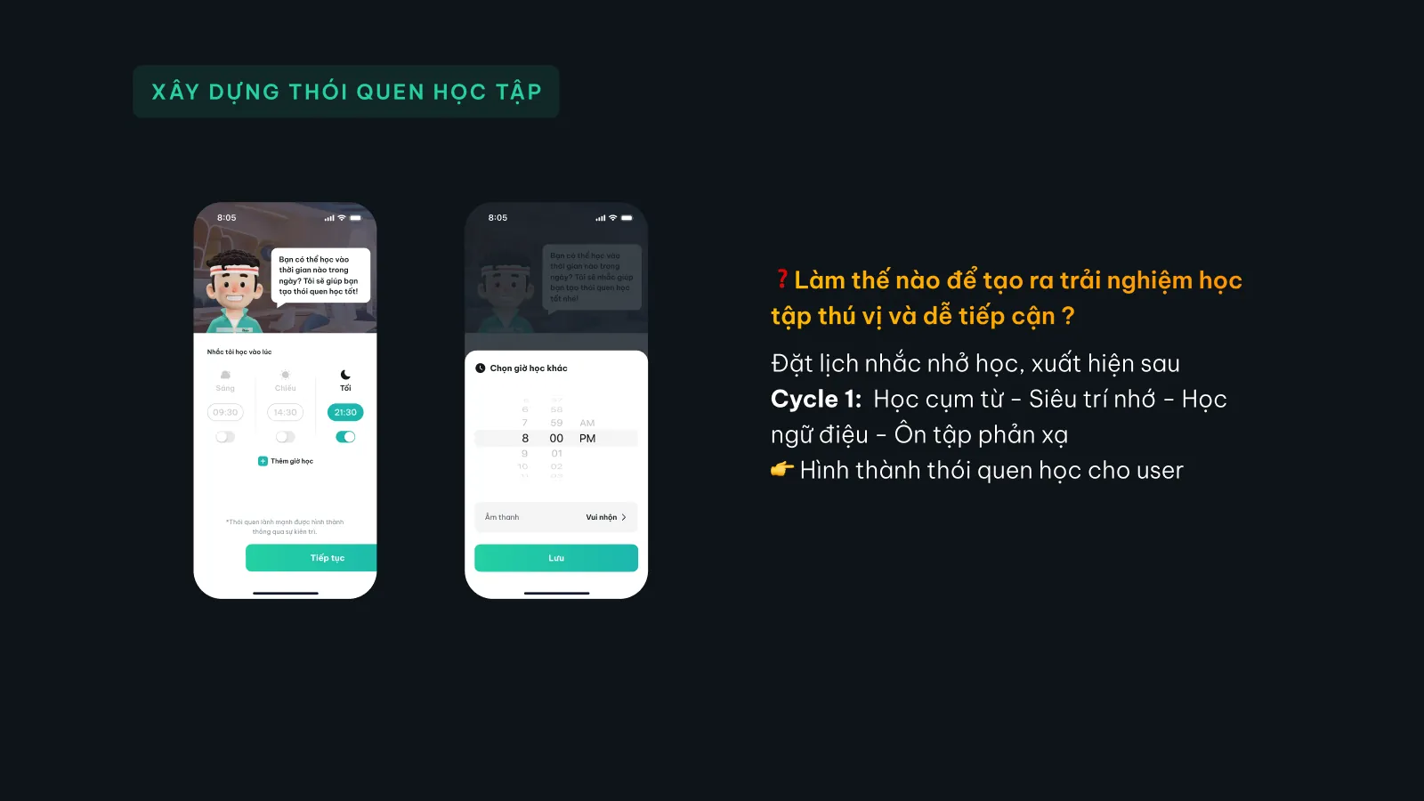
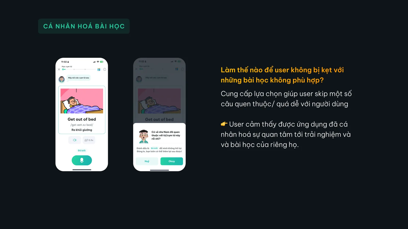
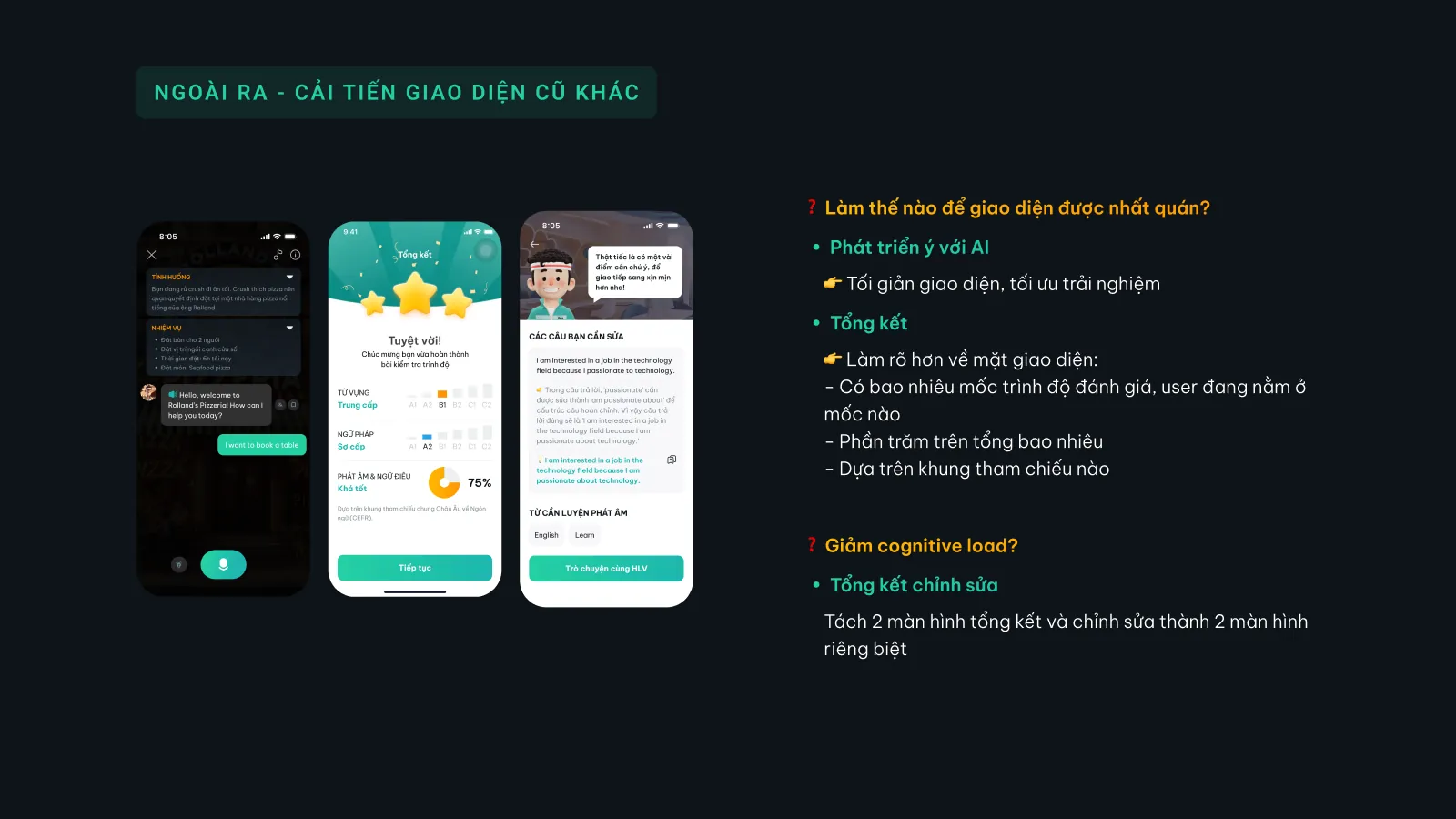
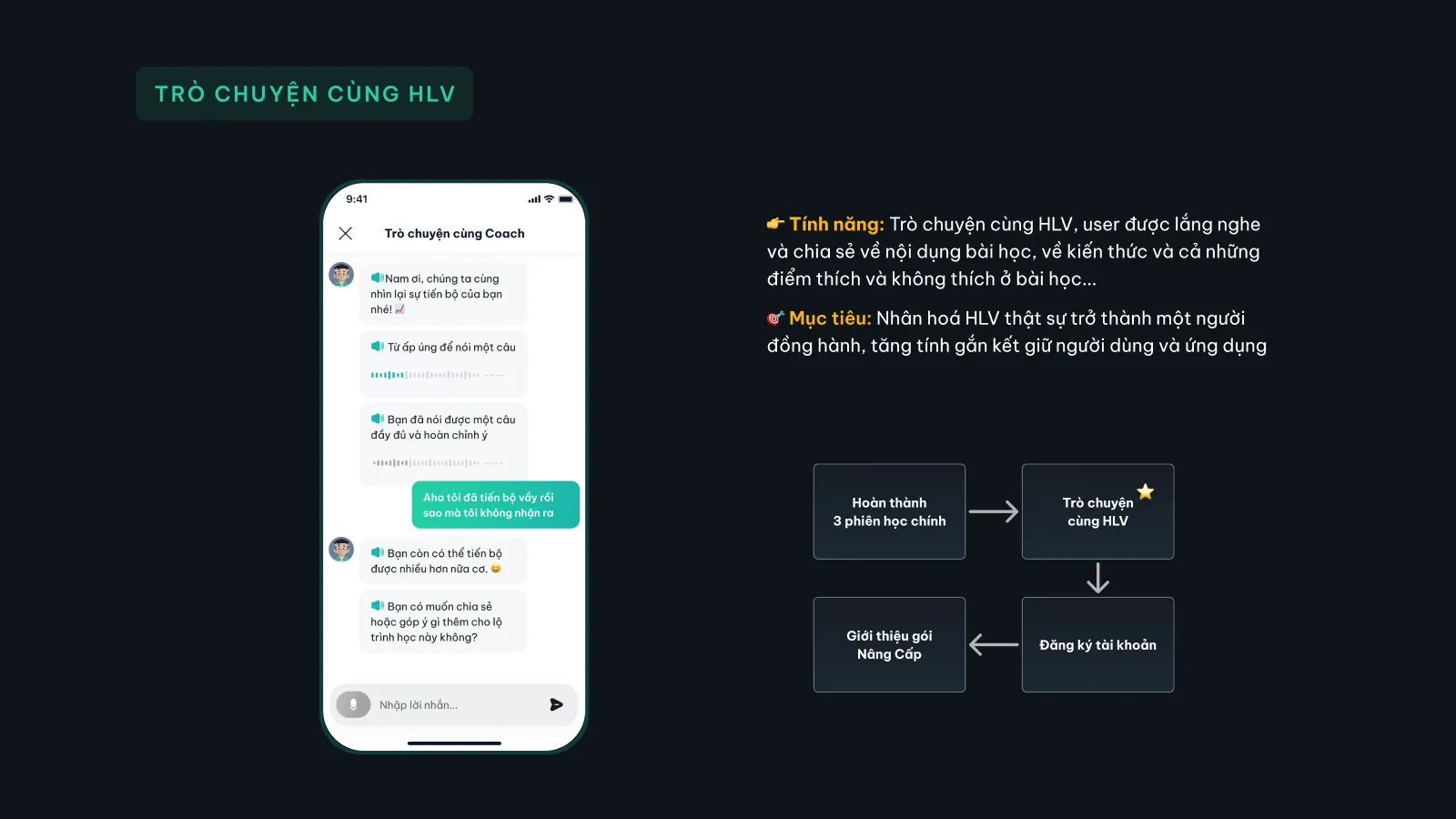
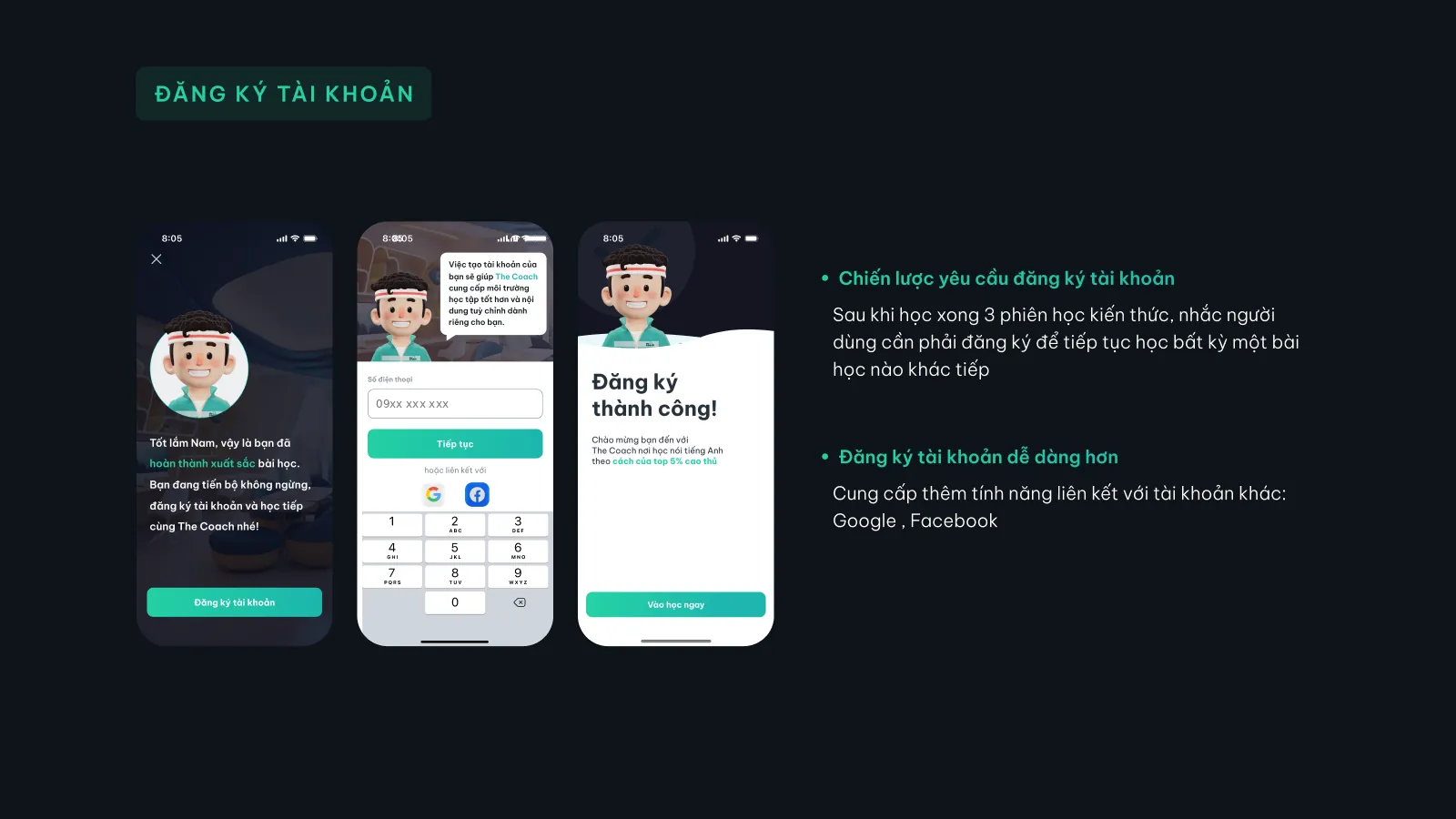
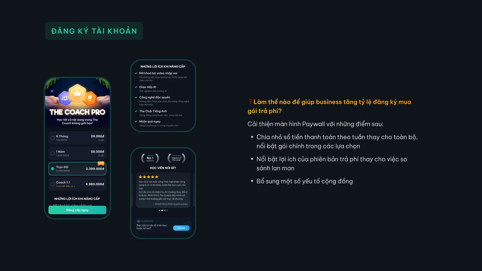
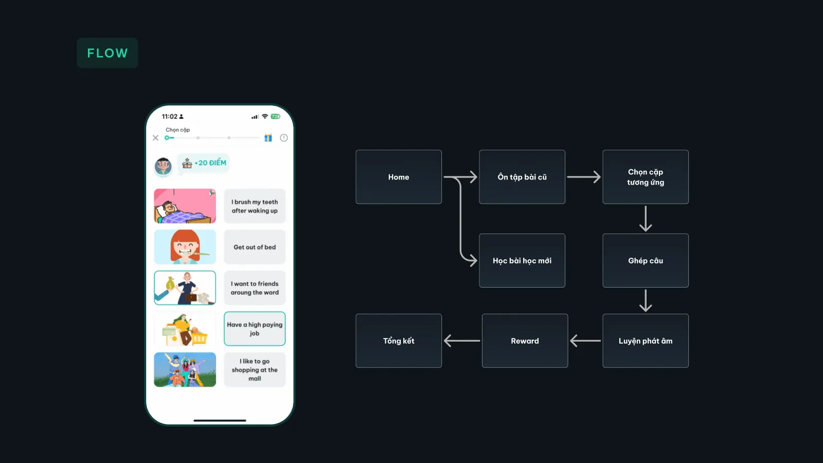
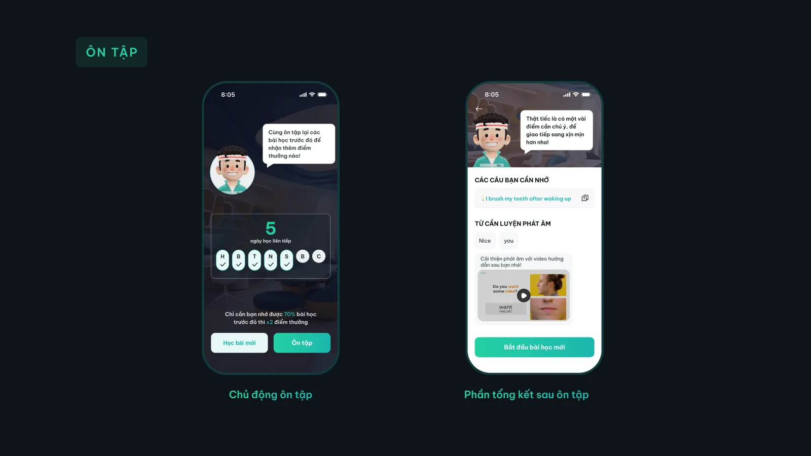
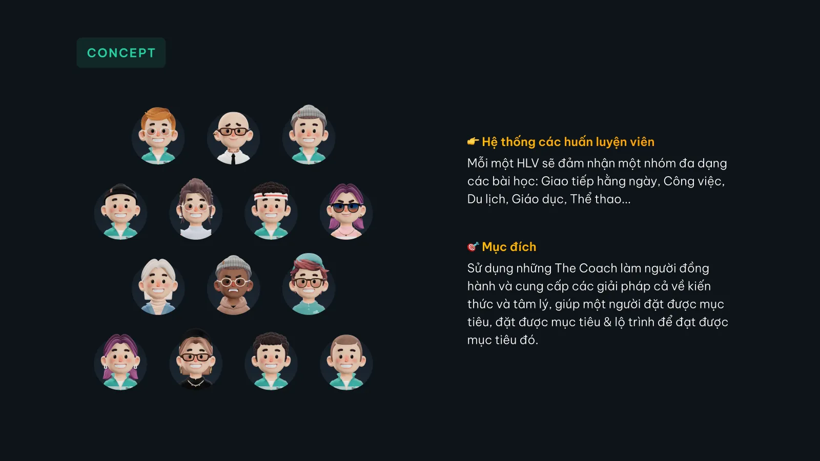
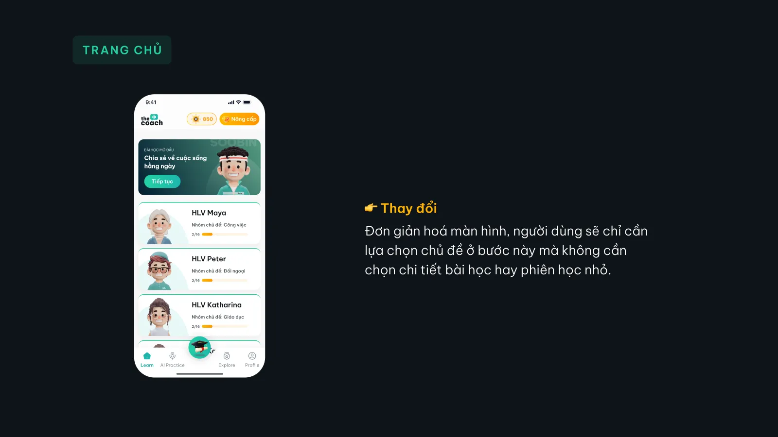
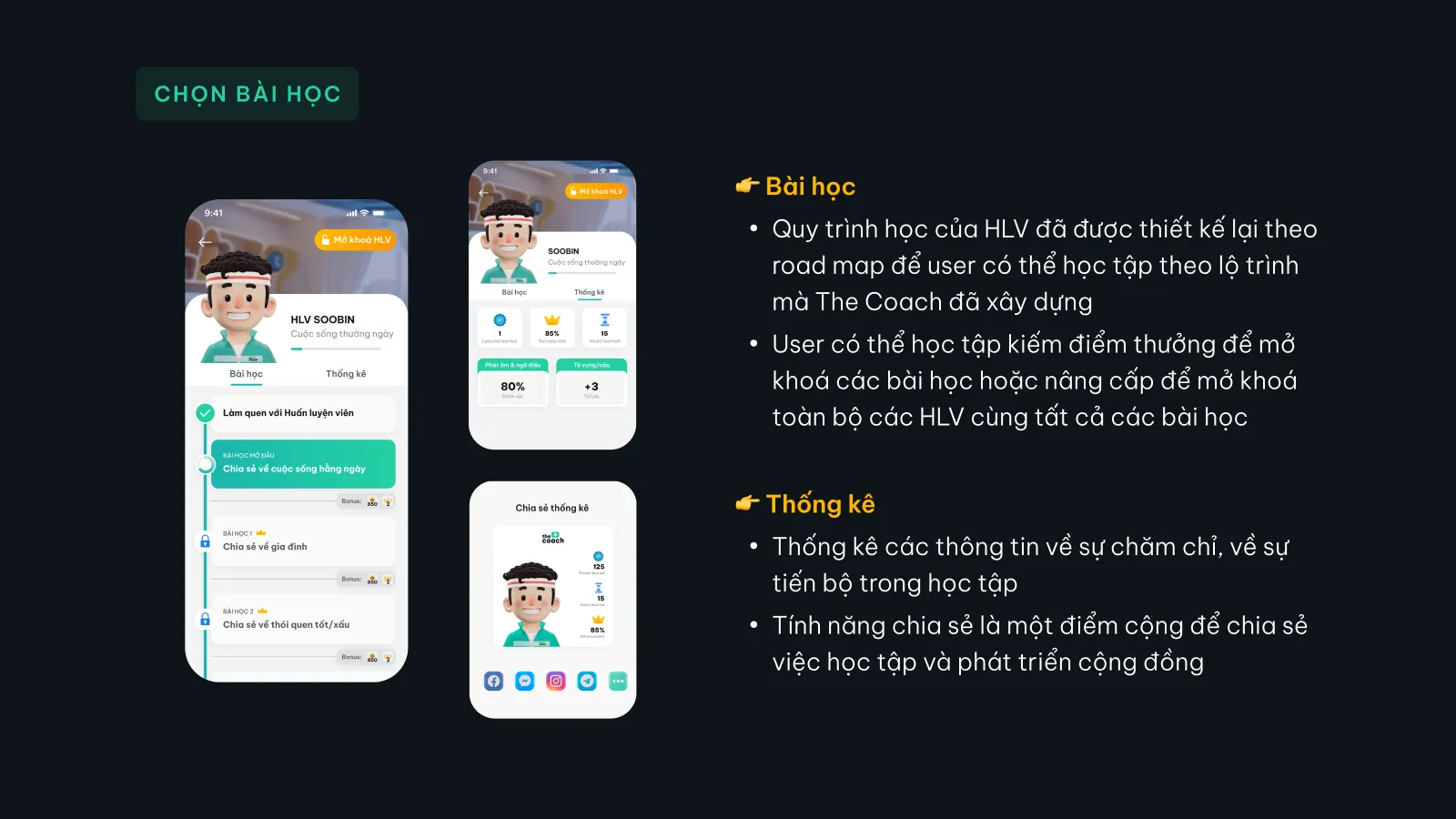
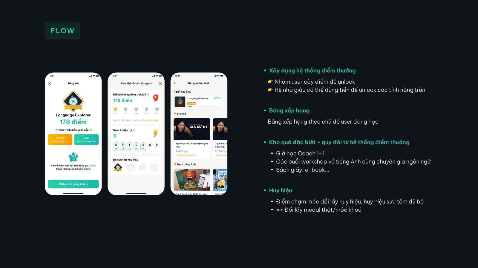
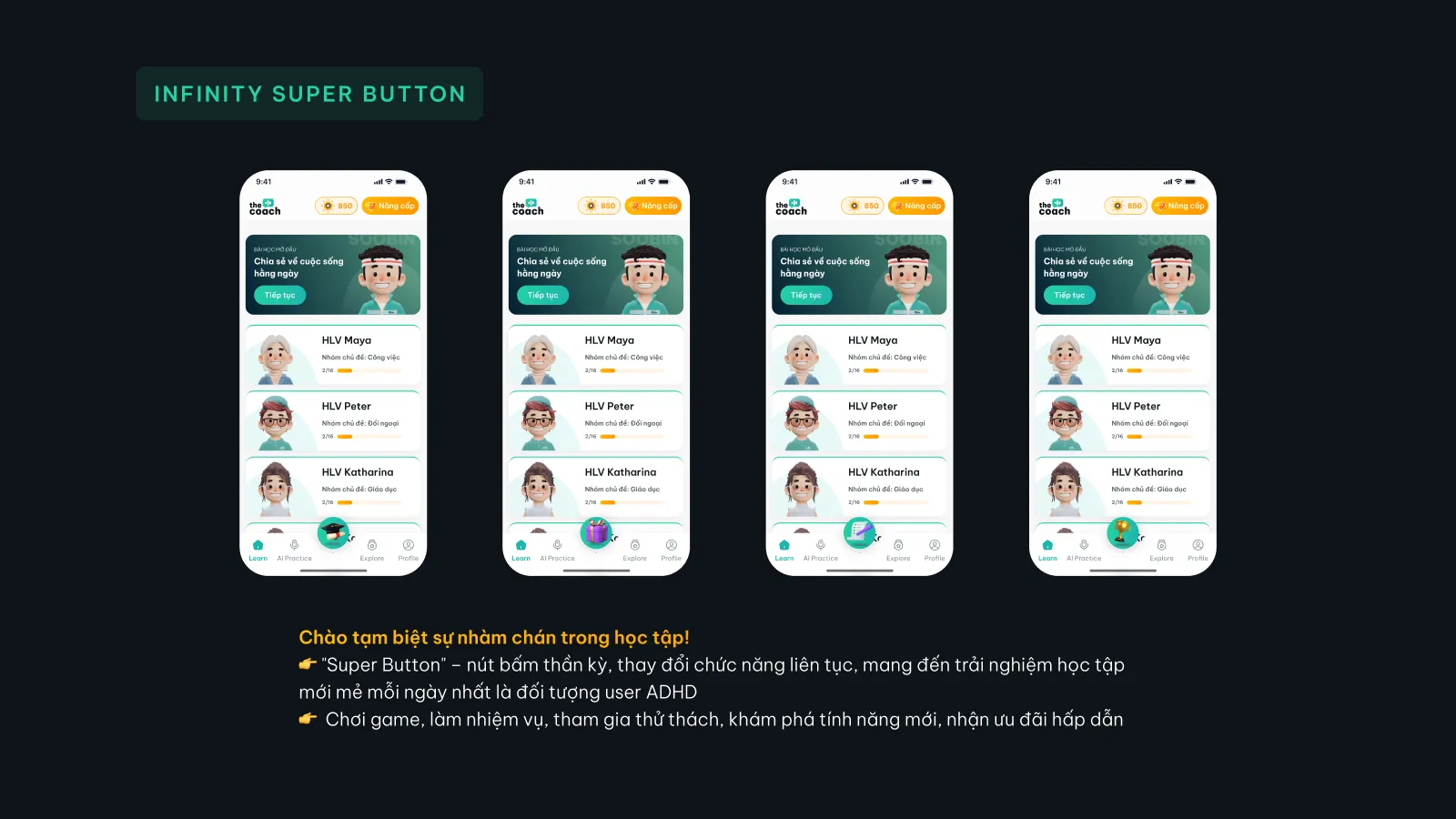
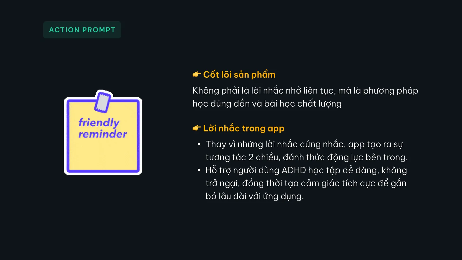
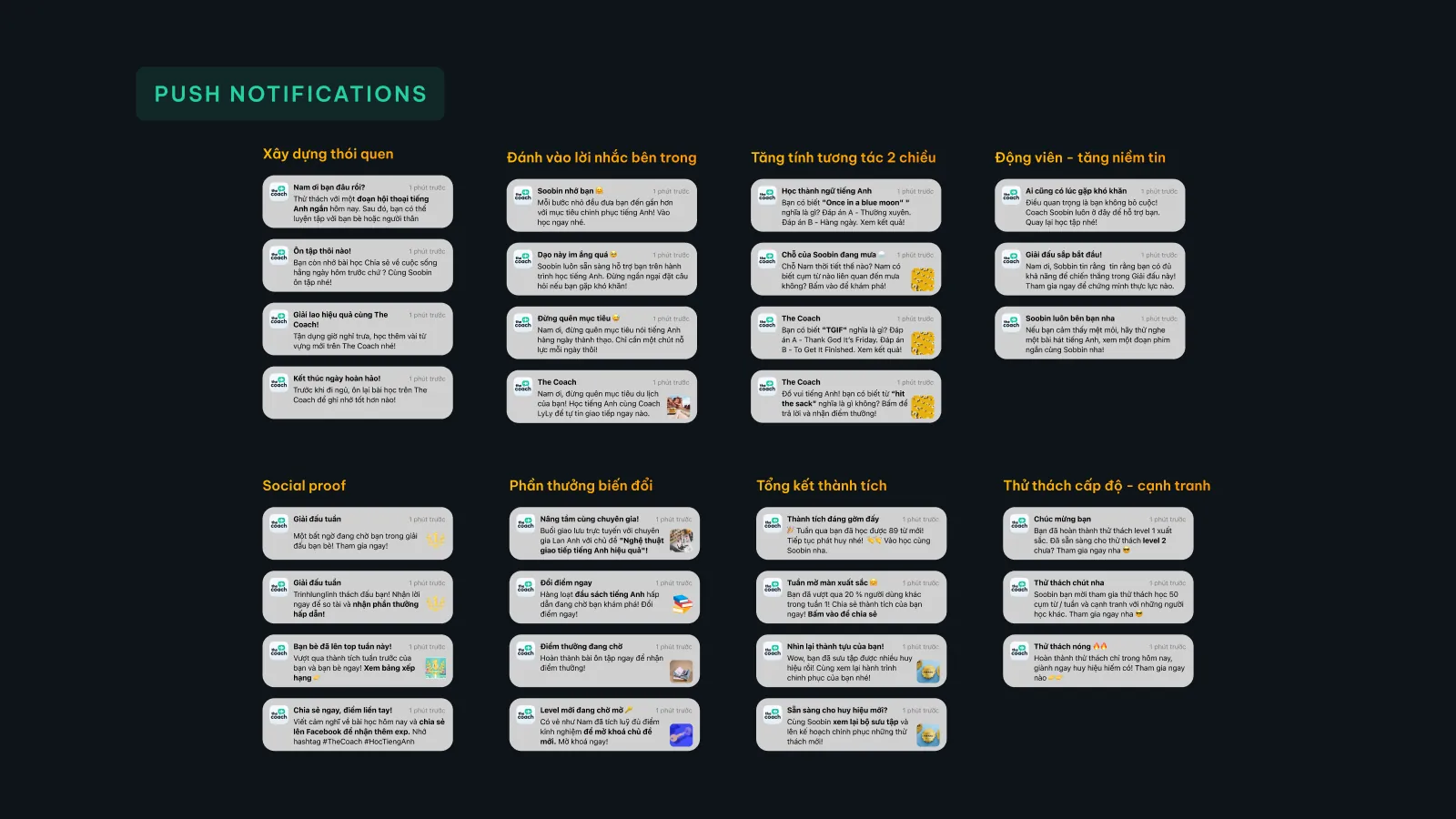
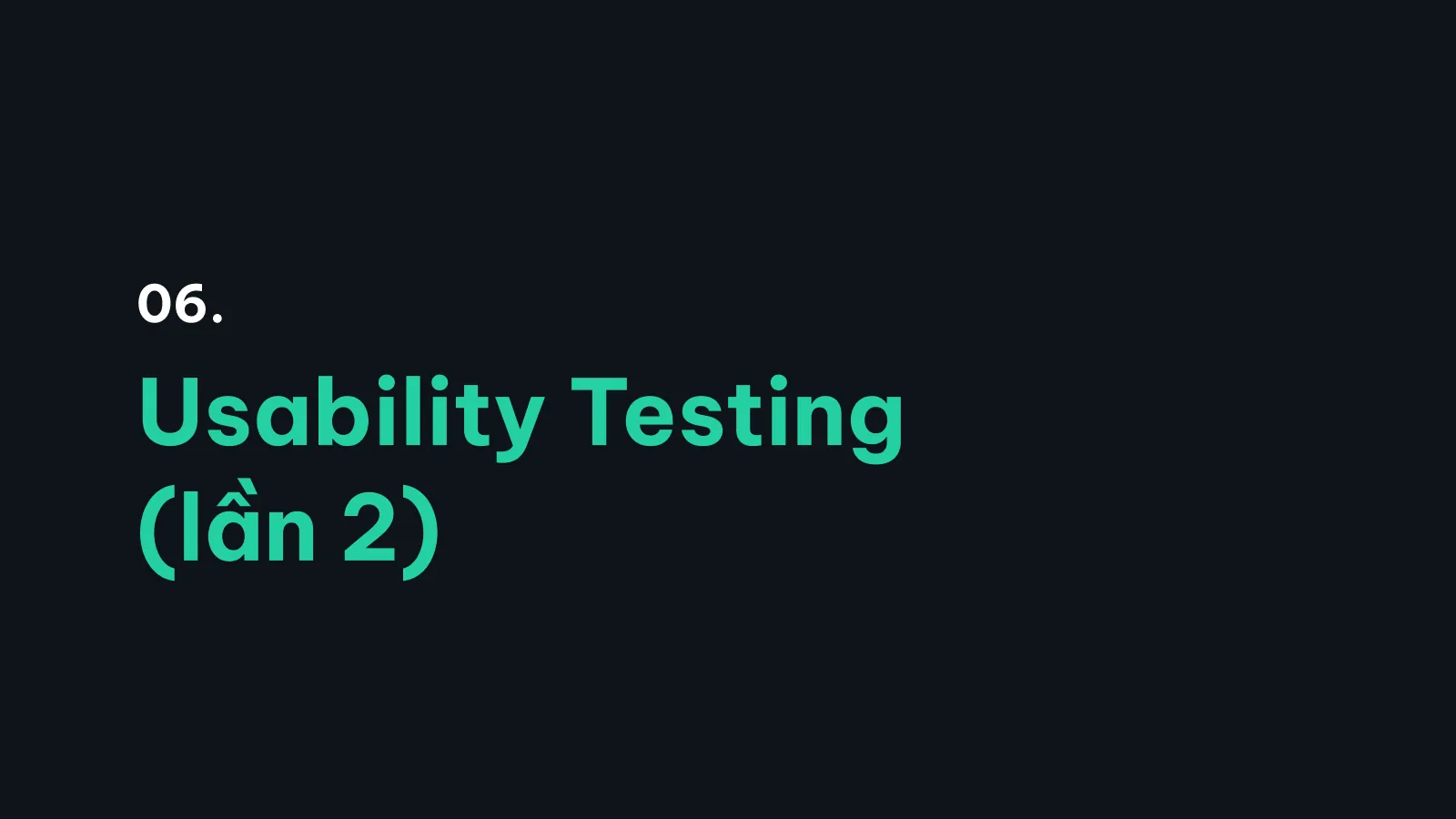
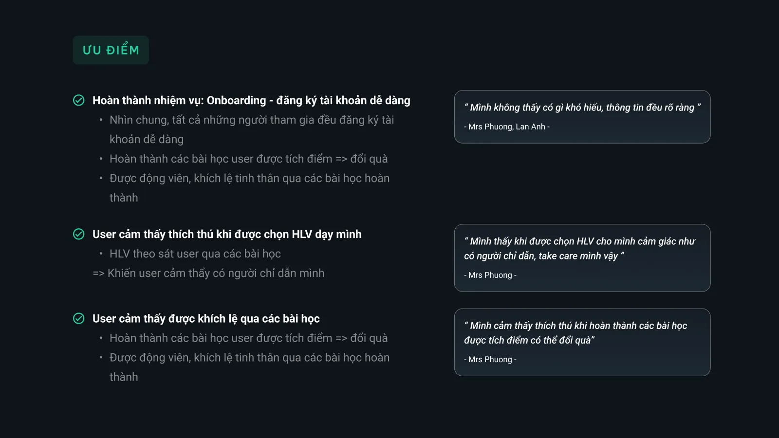
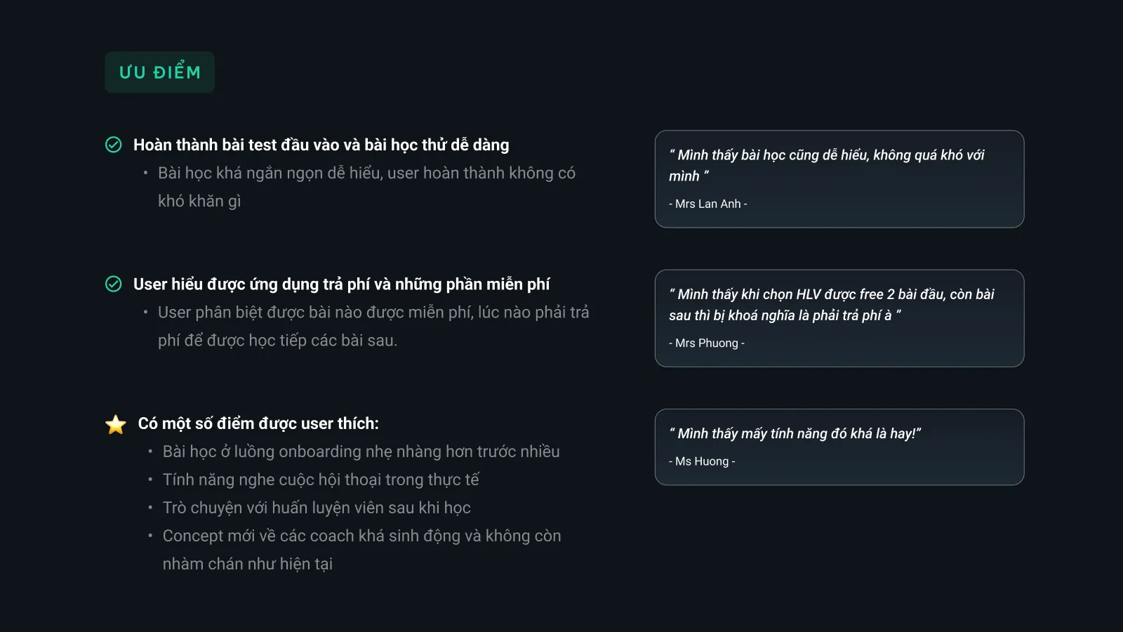
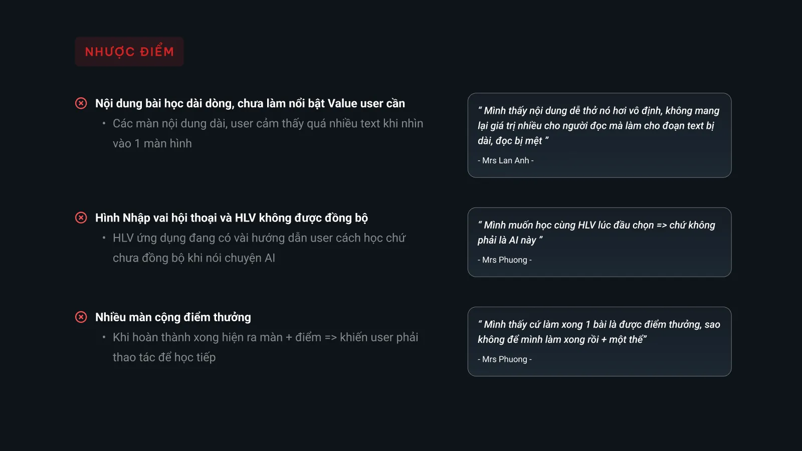
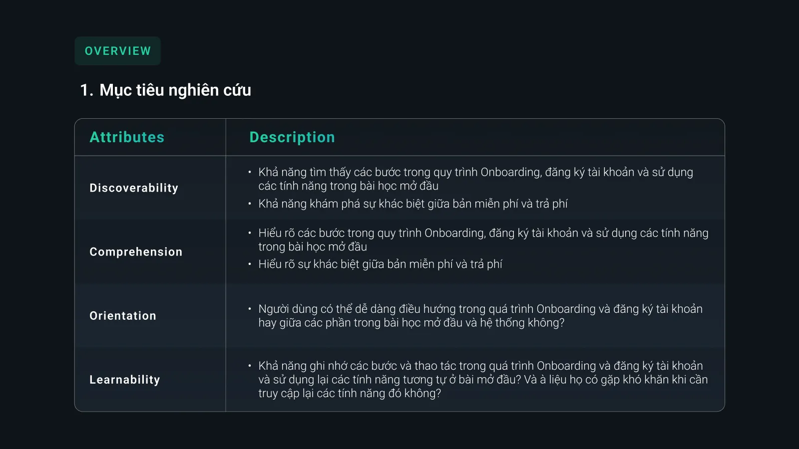
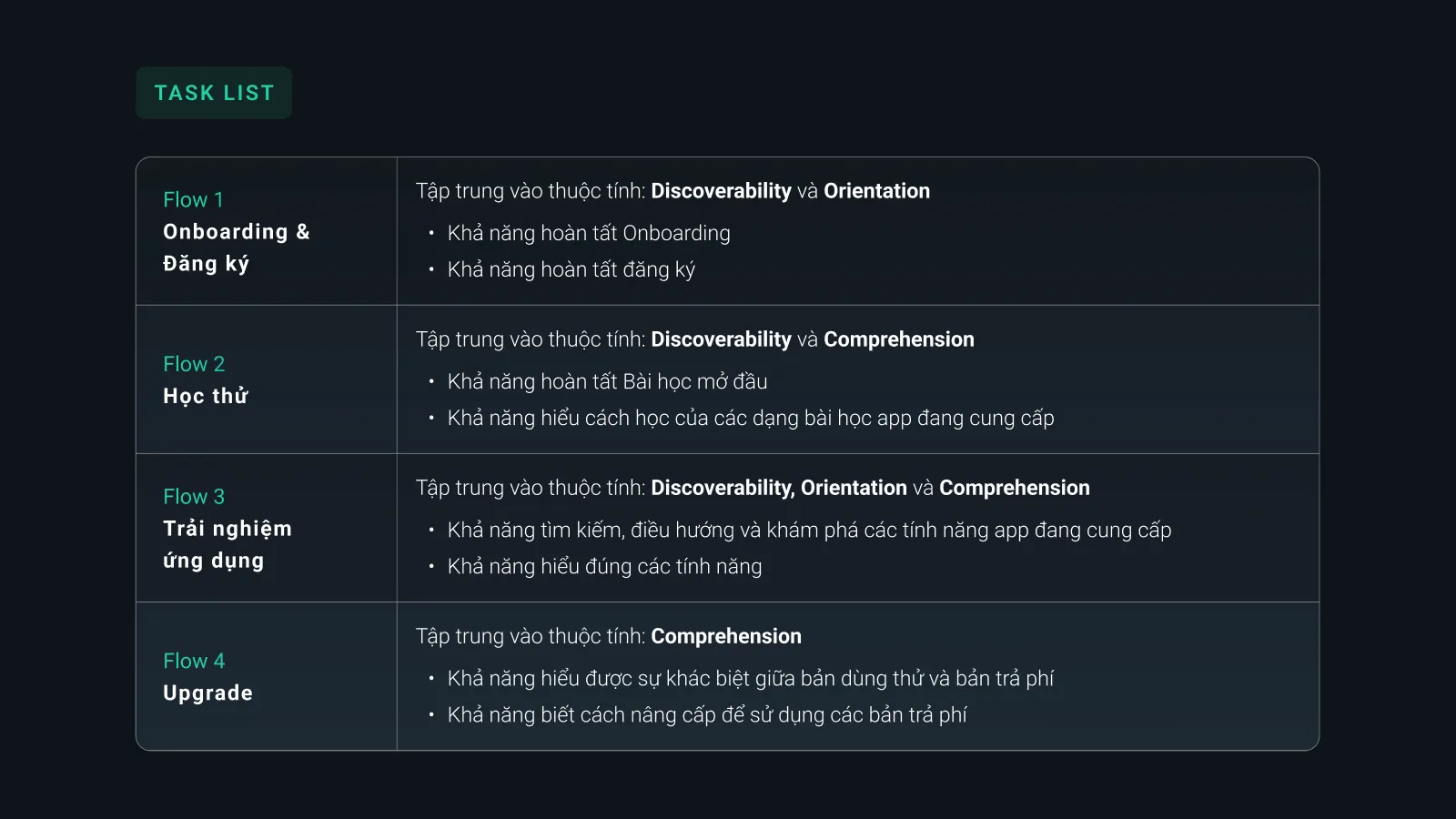
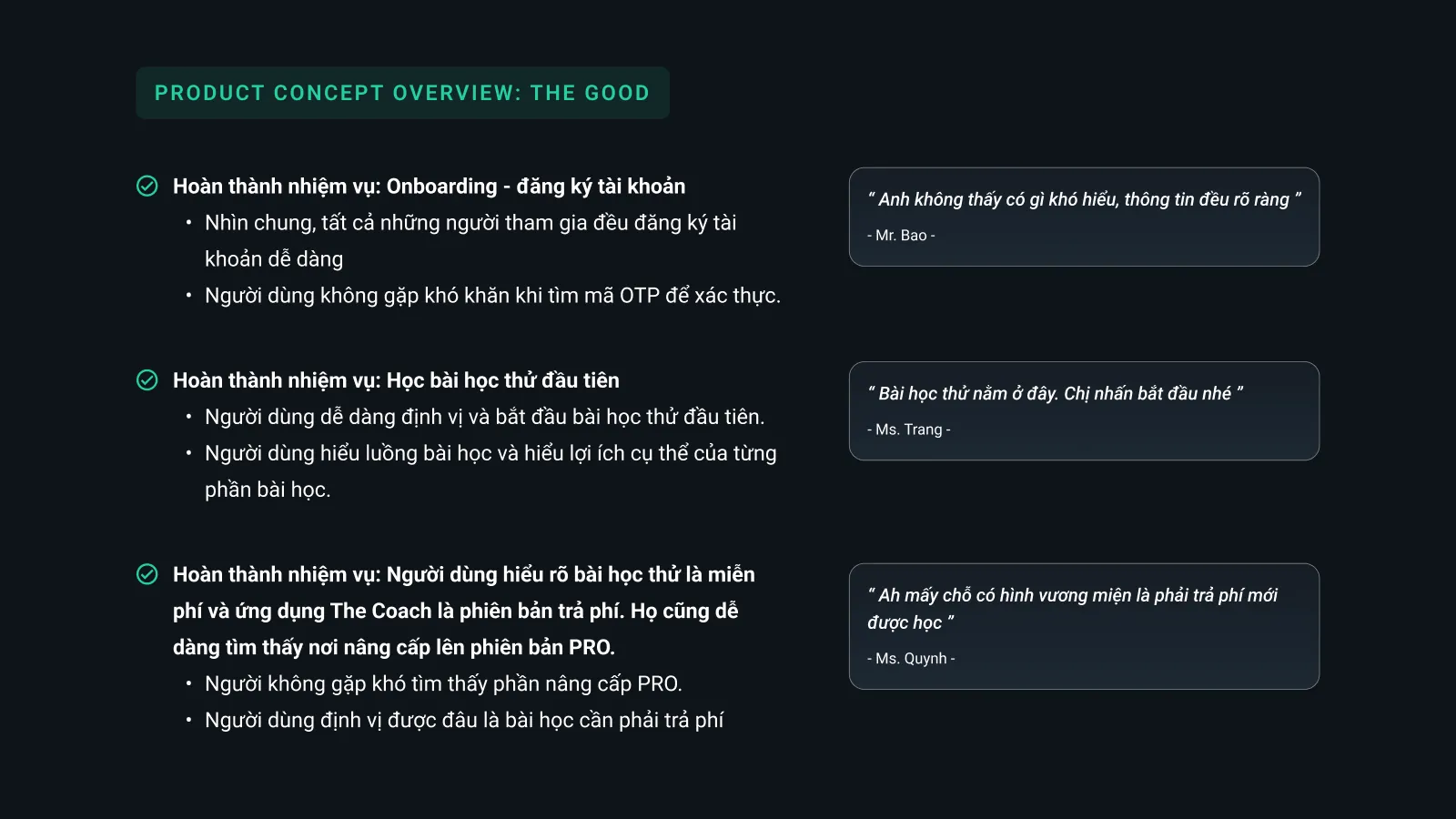
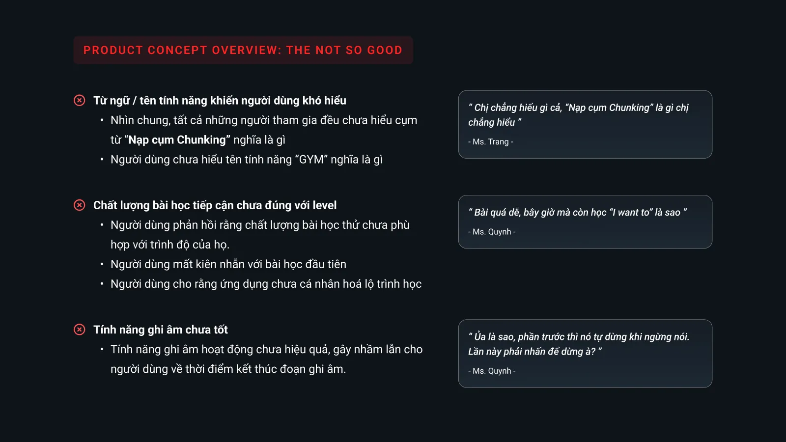
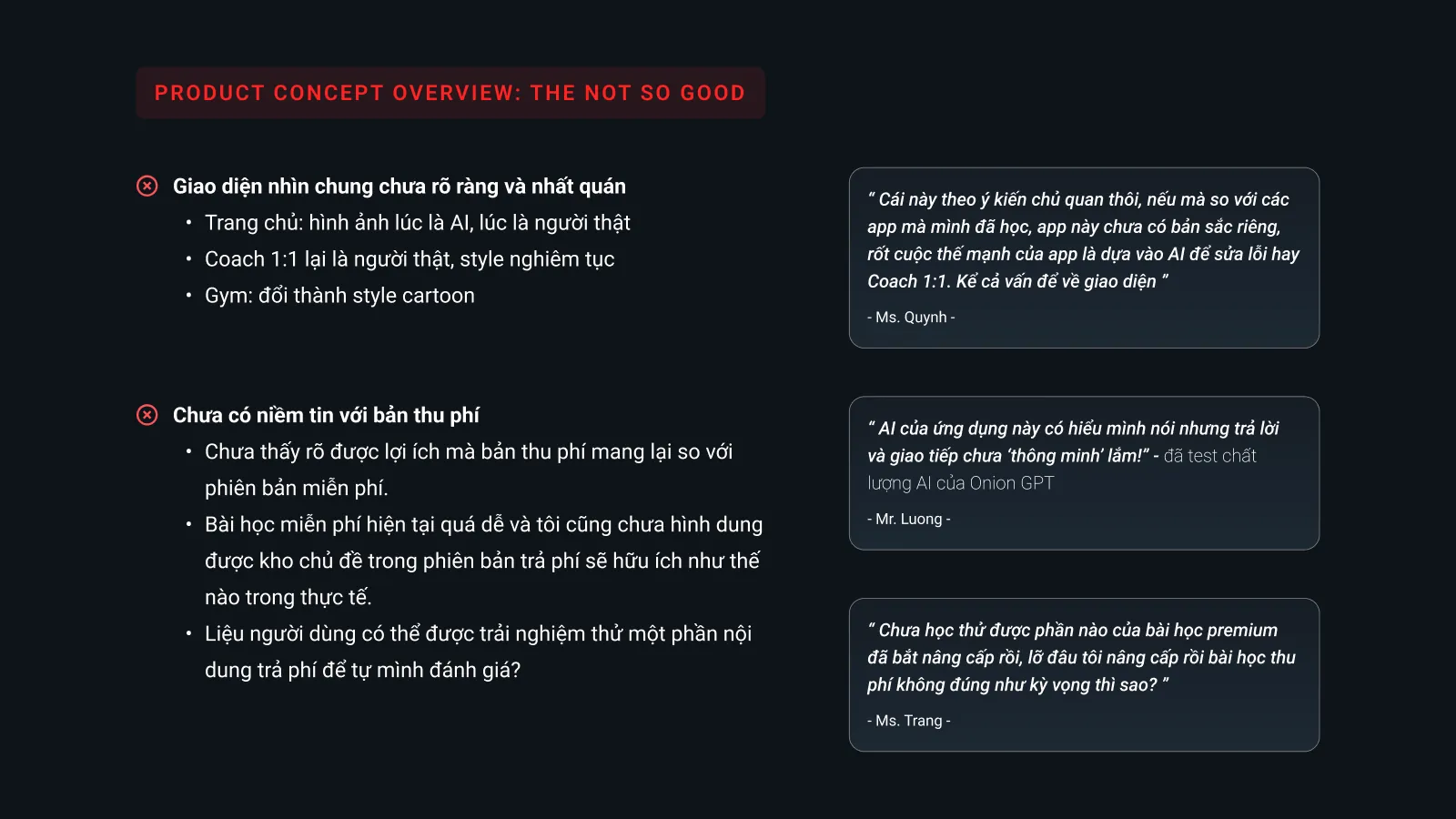
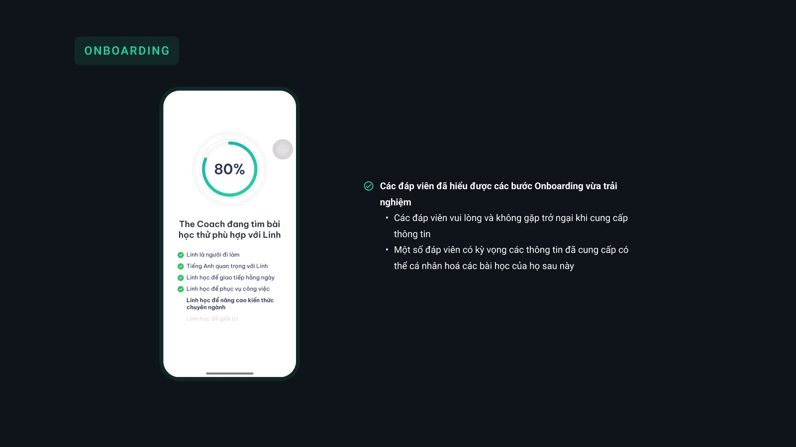
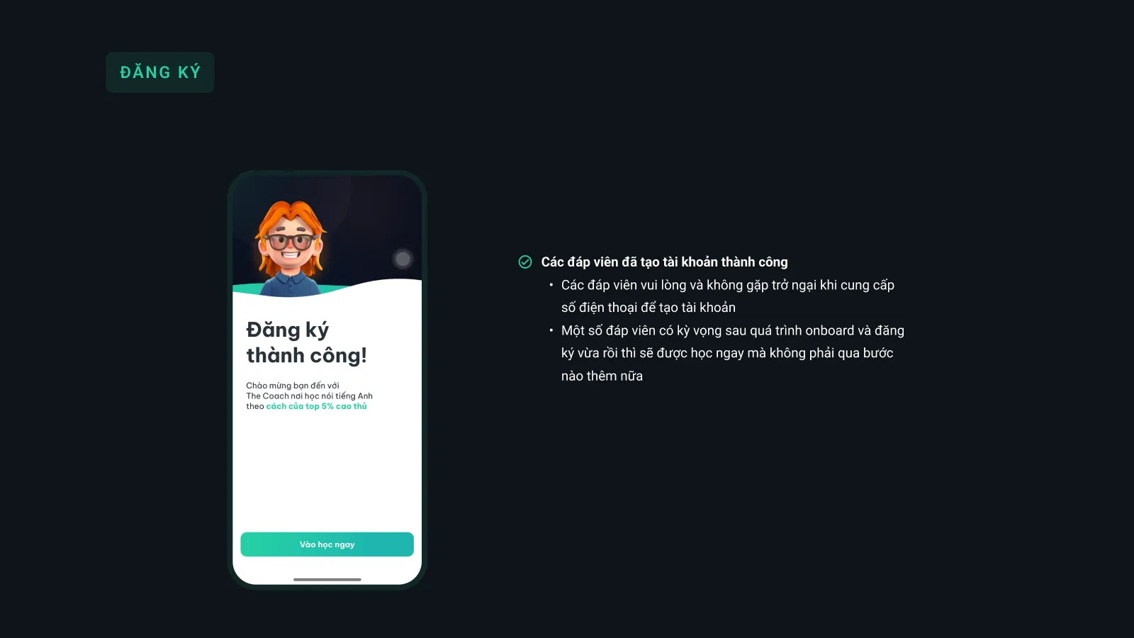
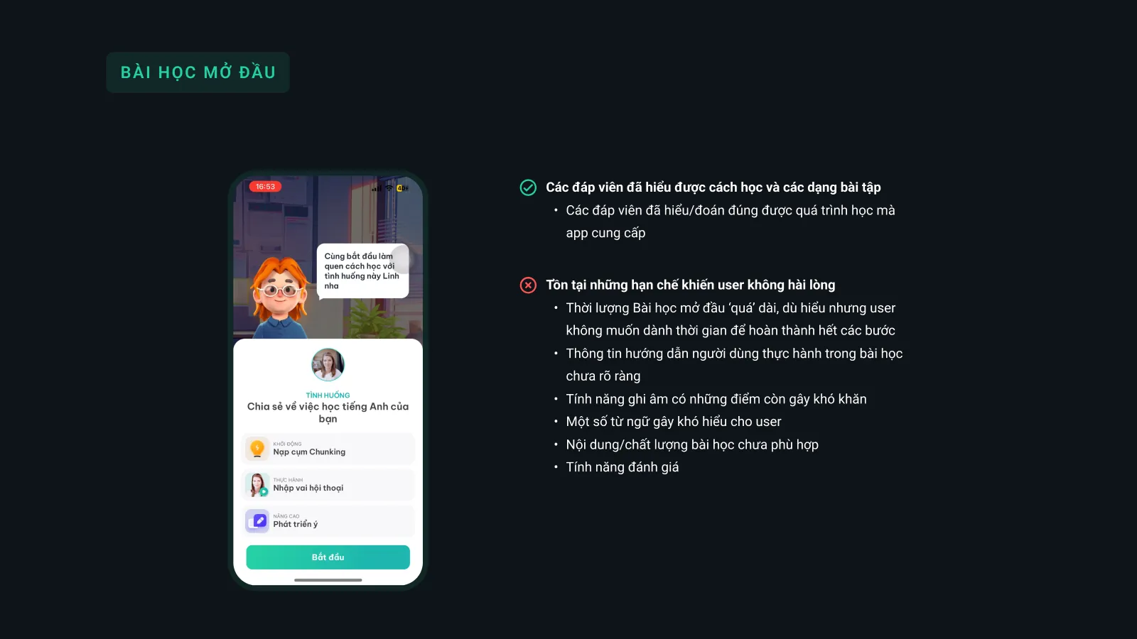
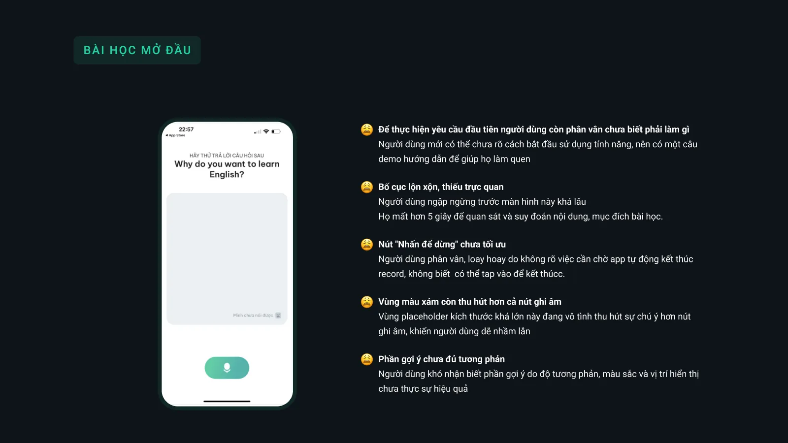
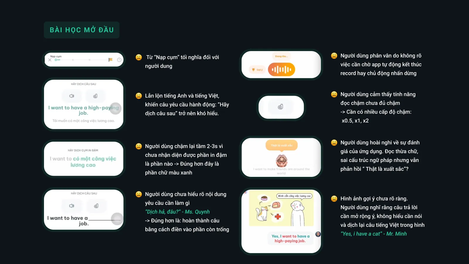
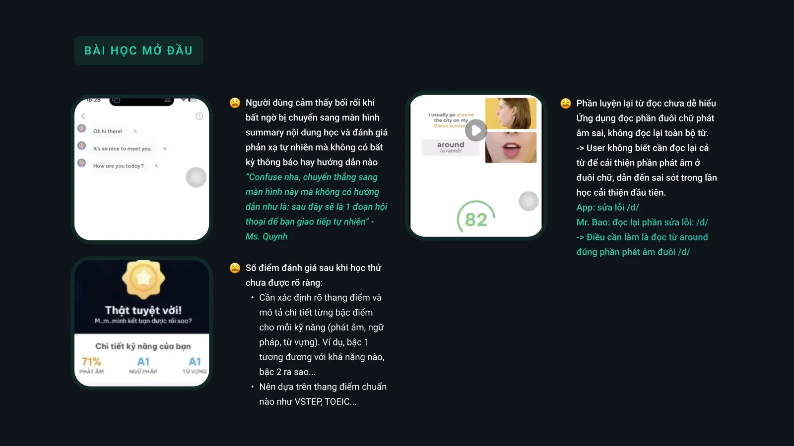
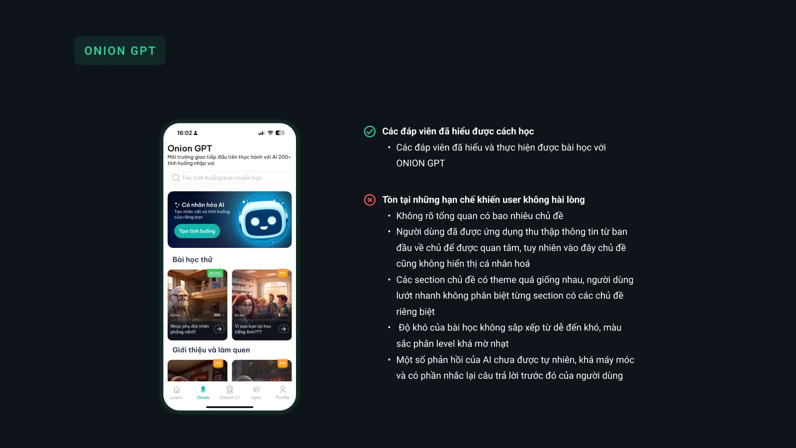
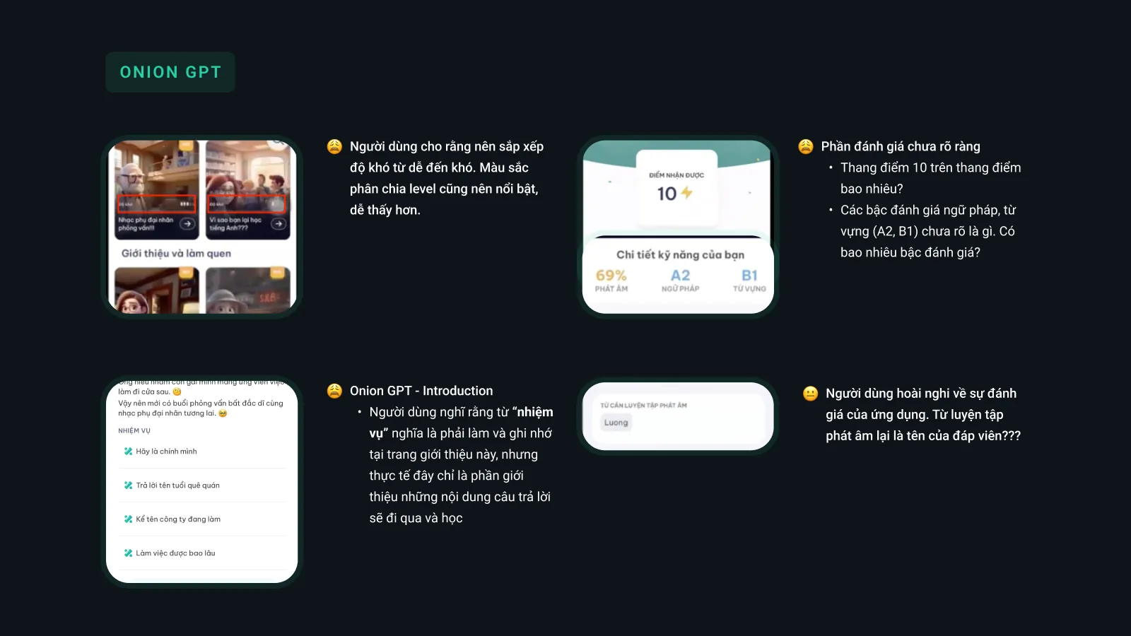
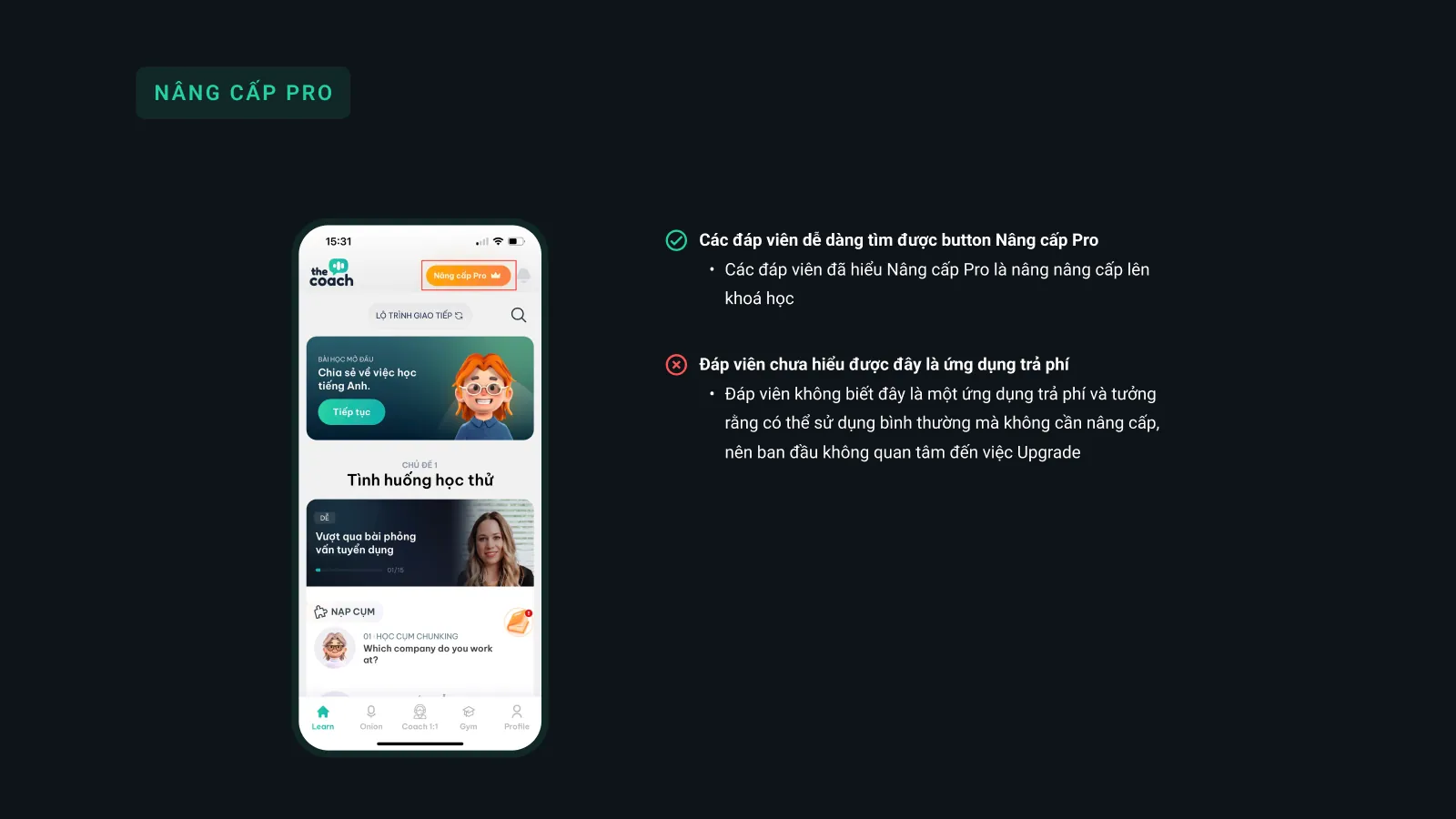
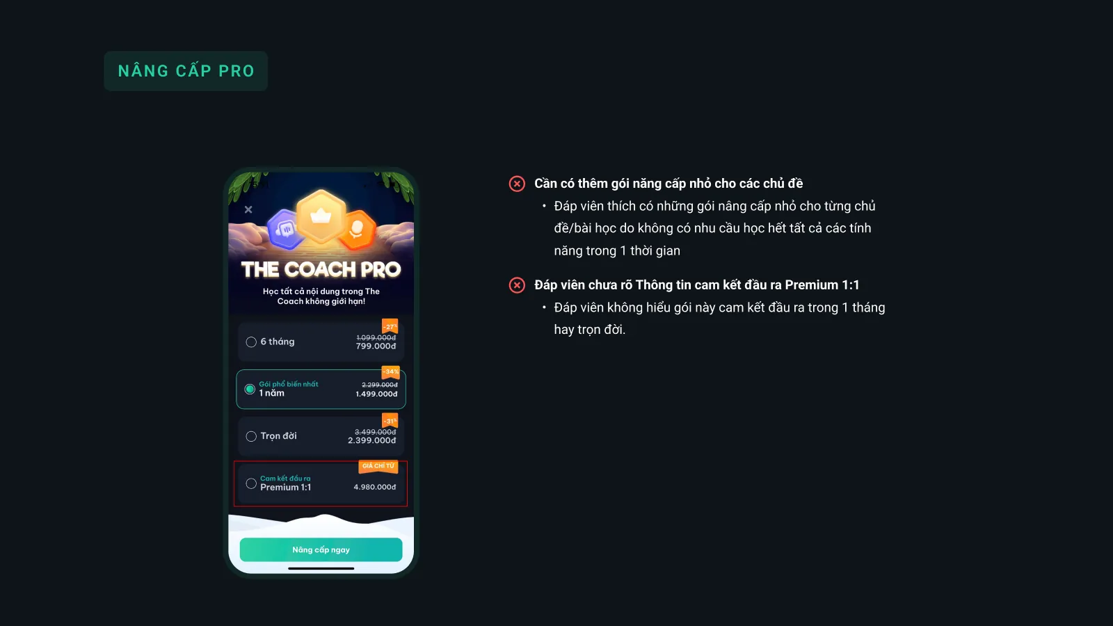
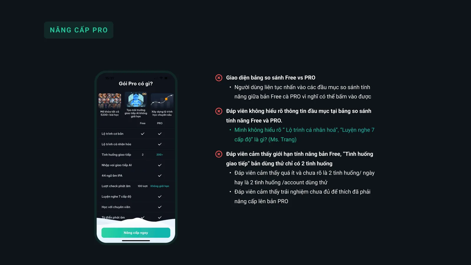
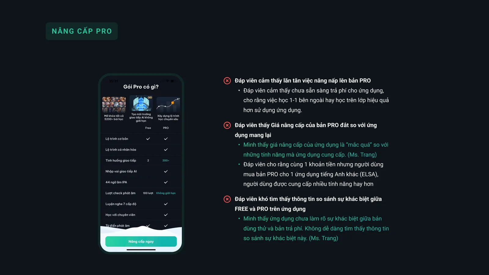
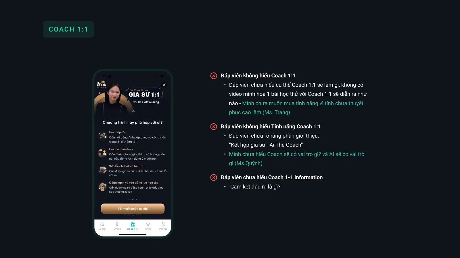
A team project from the end of the Psychology in UX Design course, chosen as Best Team. The team researched and redesigned the experience of The Coach, an English learning app, for easily distracted users: from heuristic evaluation, usability testing and journey mapping, to an 8-week habit-building strategy, detailed design, prompts and a second round of usability testing.
Rotate your phone to landscape to see the slides better.
Rotate your phone to landscape to see the slides better.
Strengths
From early ideas and sketches to validated solutions and live products, I cover the whole journey.
I don't jump straight to solutions. I listen, think, then build what is truly useful.
Every project starts with listening, not just to what is said but to what sits behind it. The goal is clarity, not guesswork.
Turn insight into focus: what to do, what not to do, and why. No guessing, only consistency.
Ideas become systems, interfaces and products, always designed to work well, not just to impress.
Refine with feedback, evolve with purpose. Because launch is not the end, it's the beginning.
Experience
10+ years of design decisions and constant improvement.
I don't chase trends. I focus on what creates clarity and measurable results.
Where I started to understand products from the user's point of view.
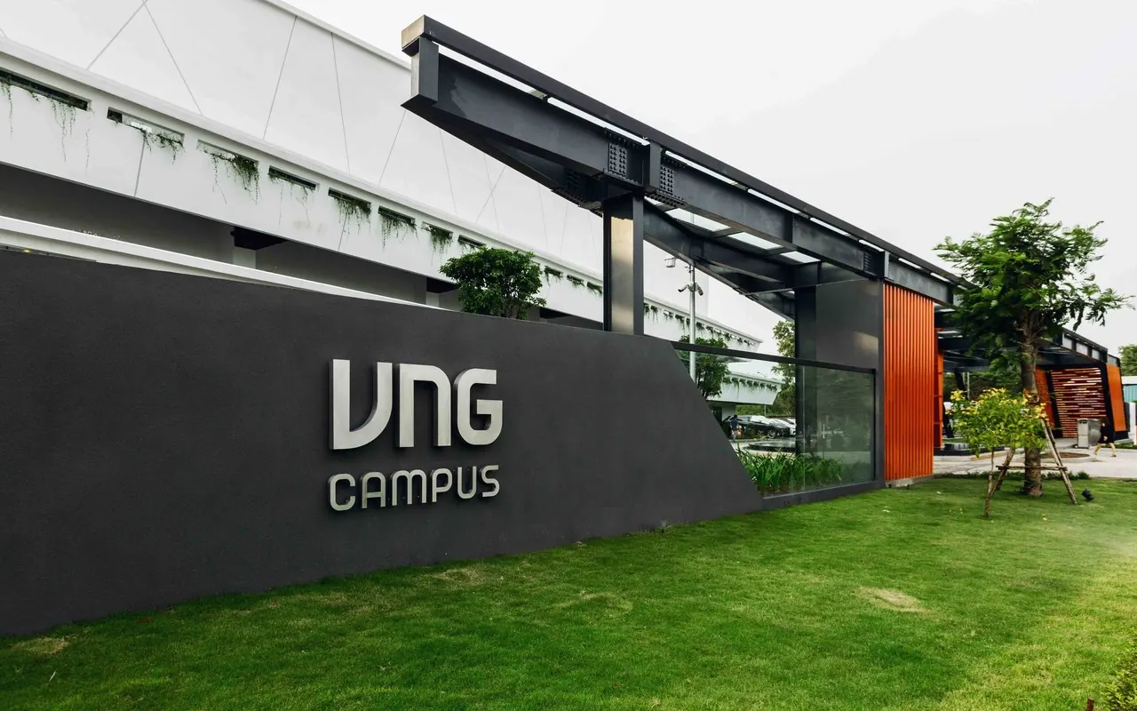
Stepping into product design, turning requirements into interfaces and interaction flows.
Led design for fintech and digital banking, building a large-scale design system.
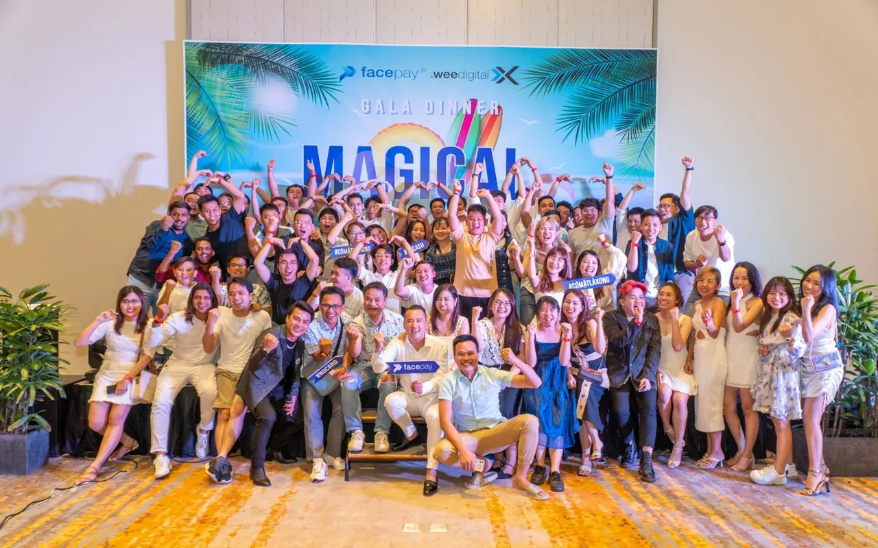
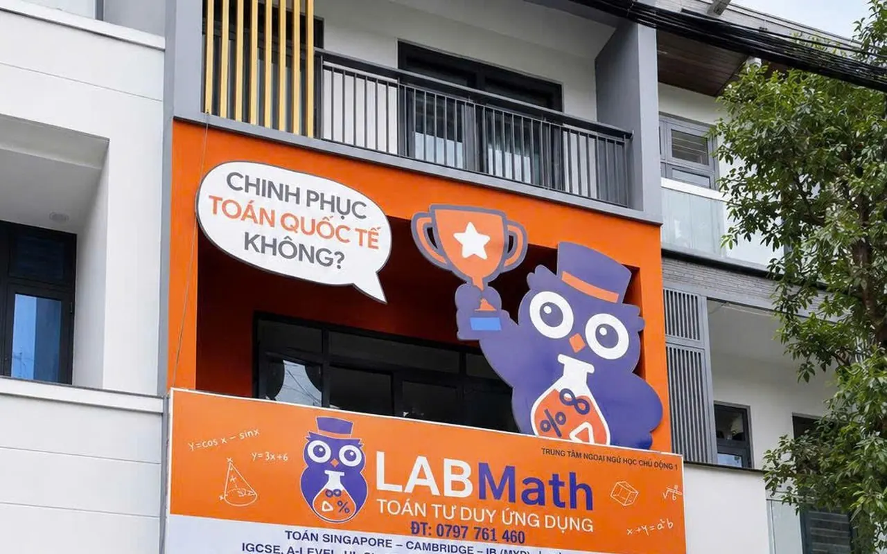
Brand and interaction design for a math education platform.
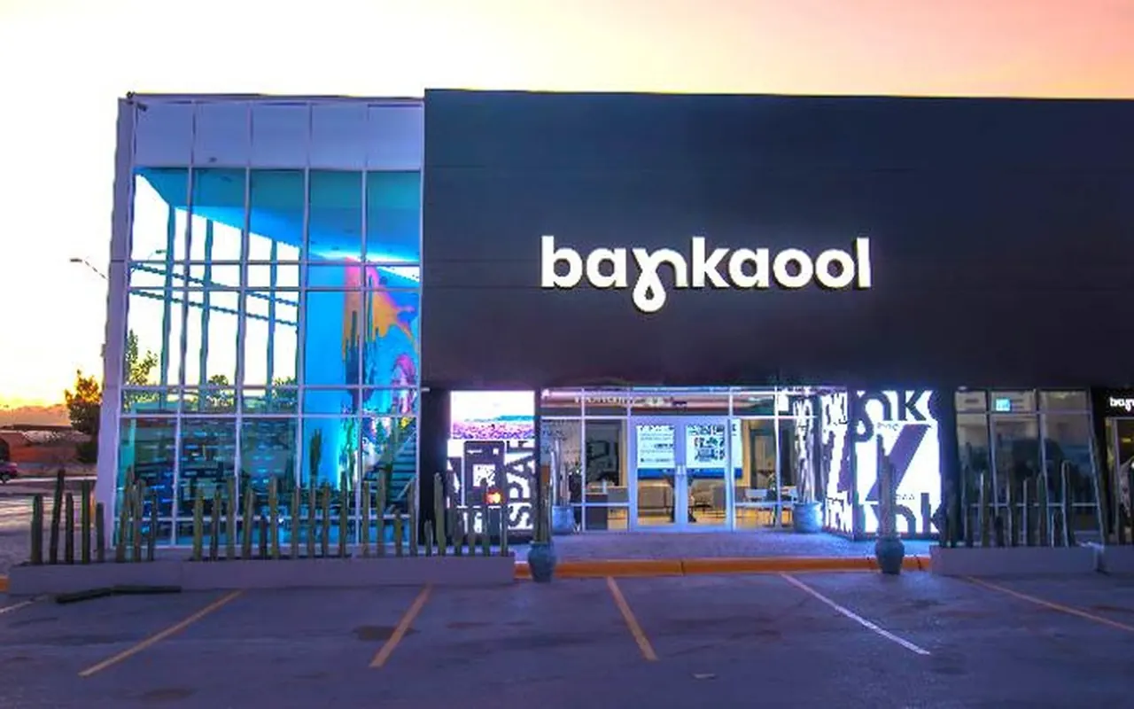
Designing fintech and digital banking experiences for the Mexican market.
Perspective
 ”
I design so complex experiences become clear and easy to use. Less noise, more intention.
Blog